Week #19
9th to 13th of January
Vertical Poster
30 minutes per version
After quite a long pause, I’m back to business. I’m doubling down my efforts to get better at graphic design. I’ve decided I will invest some money and time into finding direct feedback for my practises. I will start next week.
Another thing I want to implement with my practises is to pay more attention into the details, and not rush the final result. For that reason I will probably produce less work but more polished if that make sense.
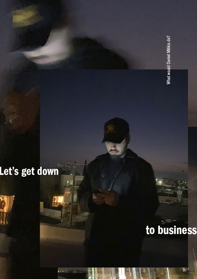
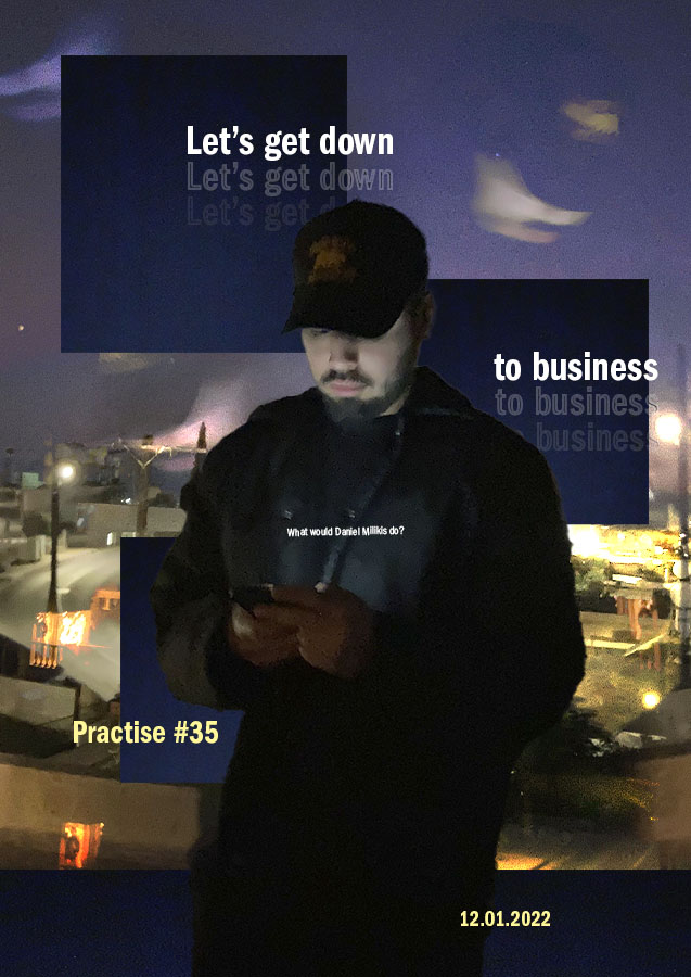
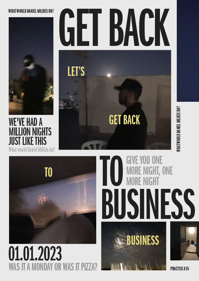
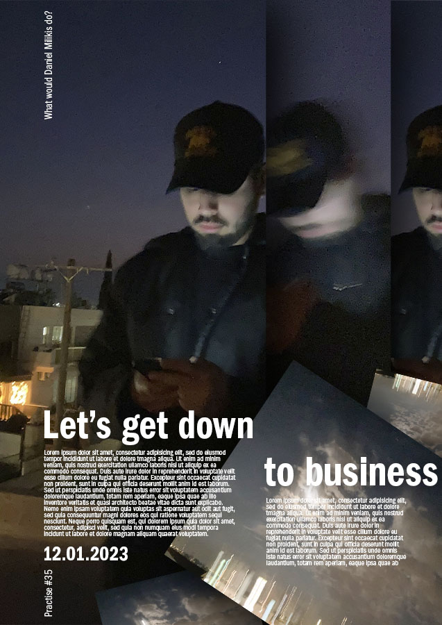
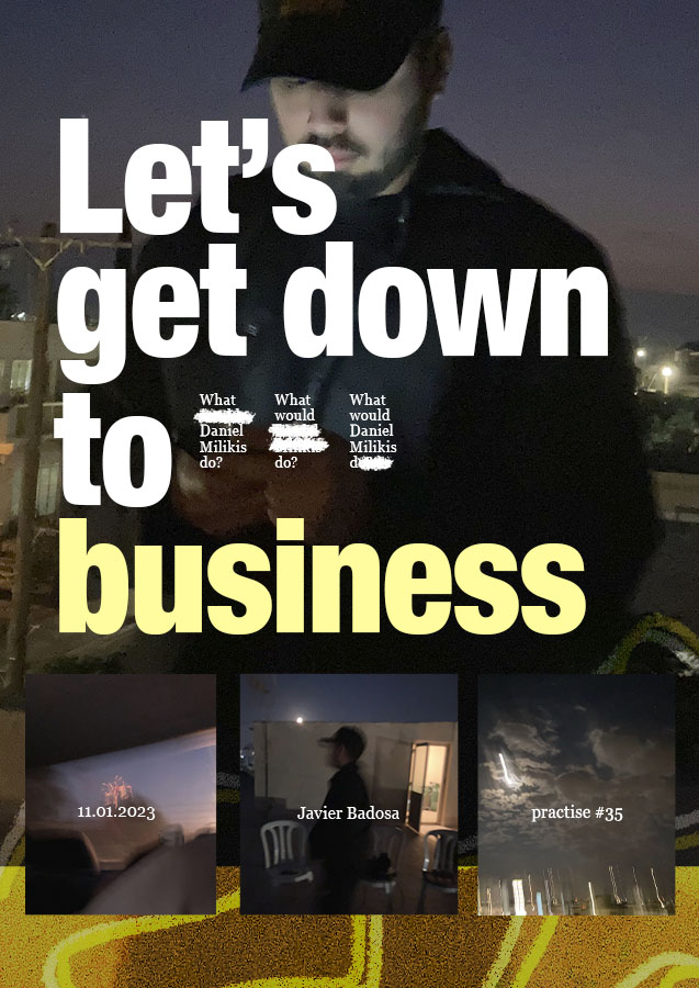
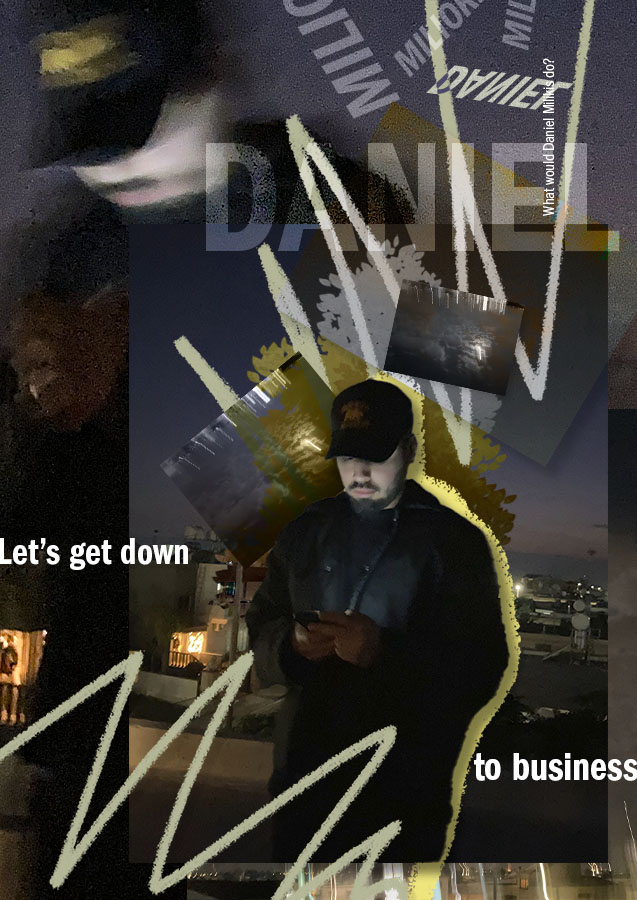
This practise is based on some pictures I took with my phone while I was in Cyprus. As you’ve notice poster design is one of my favourite formats. Mixing my own picture and playing and learning typography.
In this week I wanted to explore more saturated compositions (more elements) and also some typography that was condensed. In this case I discovered and used Helvetica Neue Condensed for small caps and ITC Franklin Gothic for all caps.

