
WEEK #13 & #14
14th of November to 25th of November


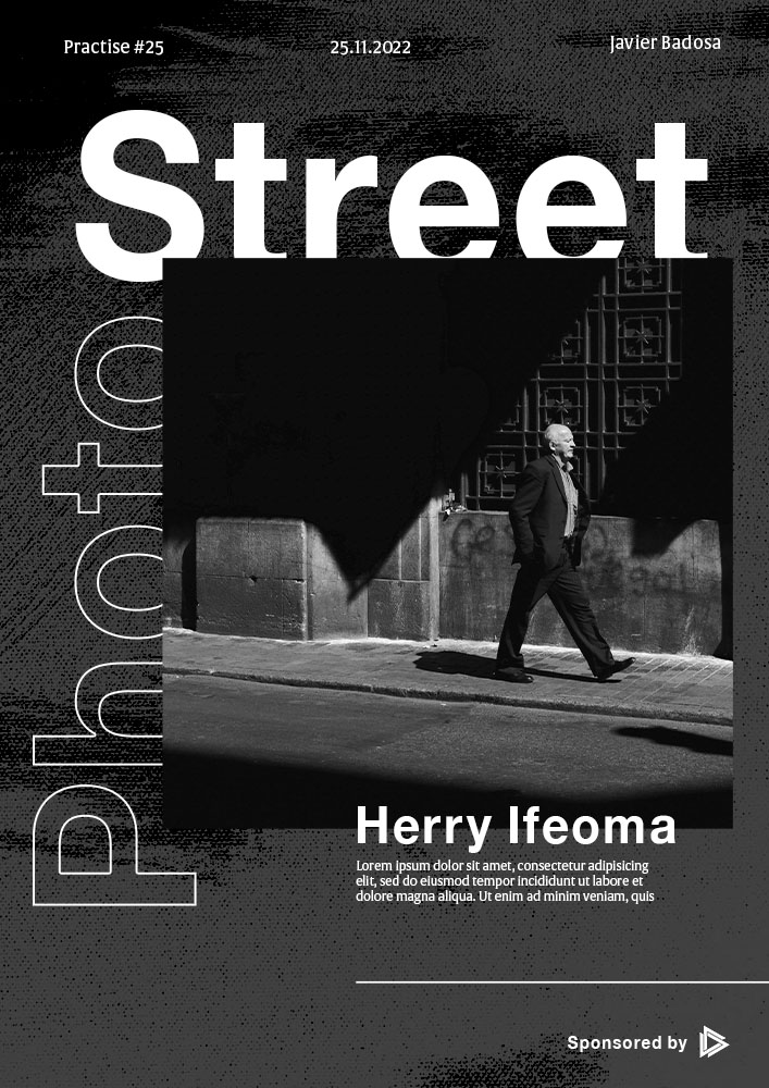
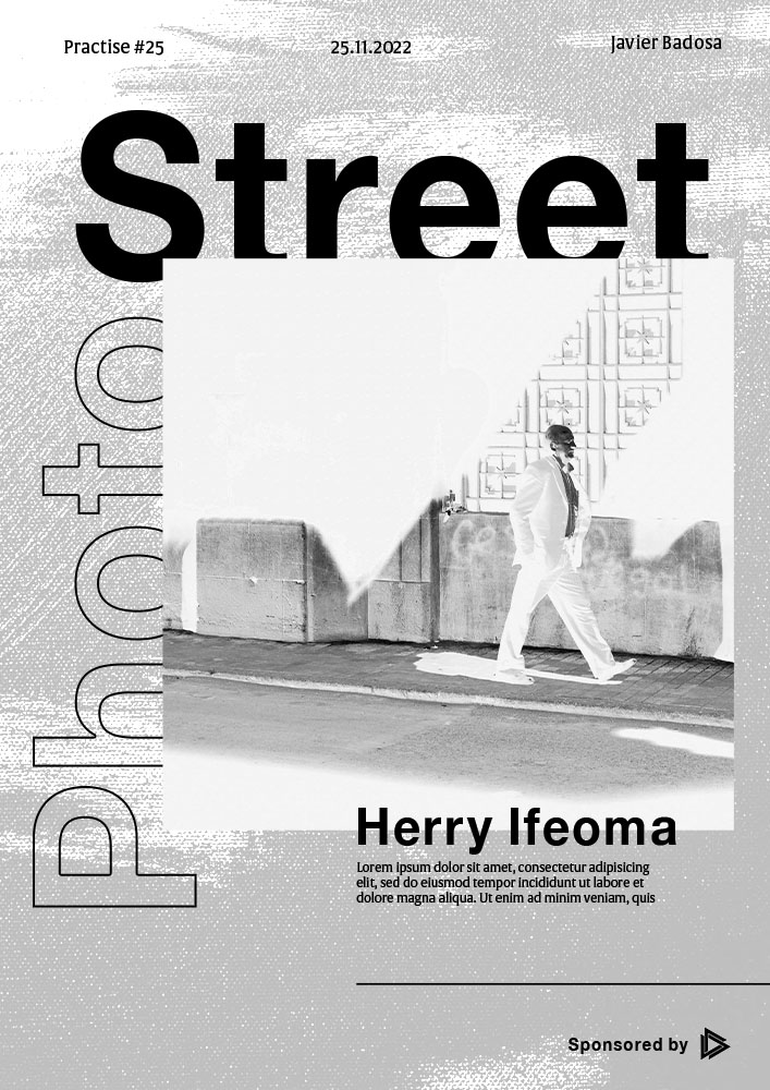
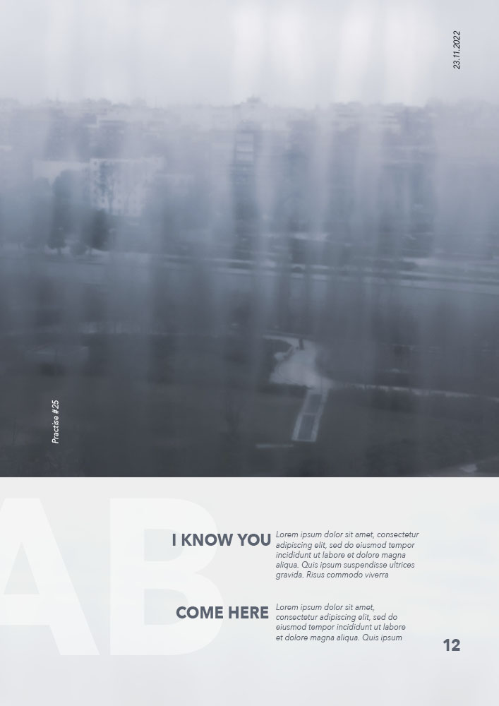
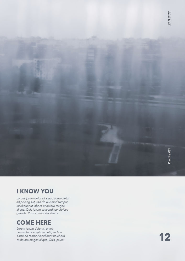


POSTERS
20 minutes each
Last week I didn’t practise at all, which felt really bad, but I was traveling and doing some other work.
Then this week I could do my daily dose of 1 hour of practise. I think I found quite a good workflow: first I watch a video or two from the course, then I go to Pinterest to find inspiration, and then I create one or two posters.
I gotta say many of these were very fun to make. I can see that my mind has a better idea on how to make the design look better.
Something that was hard was to work with very saturated colours, as you can see in the “bird poster”. It gave the sense of a clown, of something childish, so I thought of using a typography that goes with that. It also felt a bit psychodelic, and that’s why the deformity of the title.
The rest were either based on some reference from Pinterest or just our of my own process. I really enjoy poster design and I should invest clearly on it, making it my starting point of mastery in graphic design.