
WEEK #10
24th to 28th of October

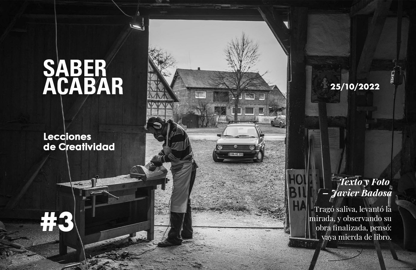
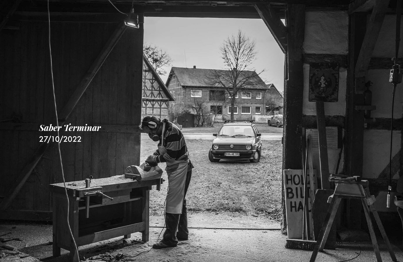
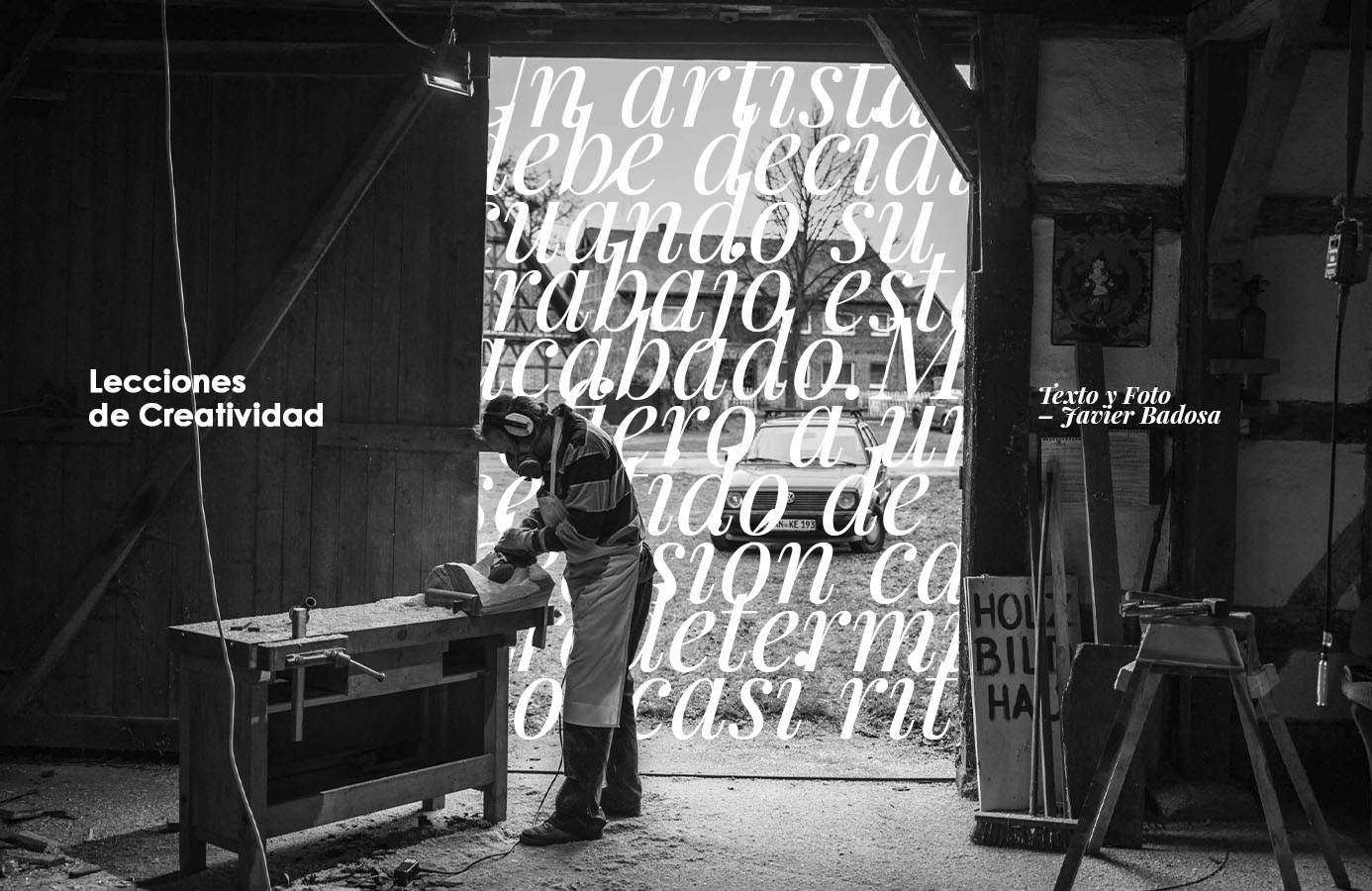


3 BLOG HEADERS
120 minutes
This practises were very fun to make. I’ve been doing more vertical posters, but I wanted to create something for me near future blog on creative lessions.
I notice that my eye is getting more sensitive to good design, mostly on spaces and weight, and how to make the design more dynamic. Before I would almost always lean towards the symmetrical, which I still love, but that it makes the possibilities very limited.
I think it is also a great practise to do a few versions of the exercise, even if they worse, because it makes you push your sense of originality. Sometimes it ends up being better, sometimes is worse but you learn something, and sometimes is just worth the try.

My Learning
I did a course on Domestika called «Introducción al diseño editorial» by Pablo Abad. The guy is great on his field, but the course was not good enough. I mean, if you’re looking for a behind the scenes project it might fit you, but there is a lack of lessons and guidance into what a beginner may suffer from.
On the other hand I started a course also on Domestika called «Cómo elegir tipografías» by Enric Jardí, and it’s really great. So far it’s been more theory but it’s extremely valuable. You can sense his educational background, and how much he knows about the topic. I’m looking forward the more practical lessons, but even just with the information I got already, I feel I have a better understanding on typography.
Check out Domestika course because they are worth while.