
WEEK #11
31st of October to 4th of November
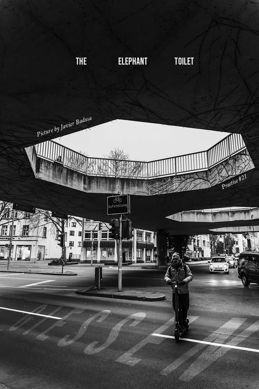

POSTER
30 minutes
This was just fun to make. I wanted a break from the previous exercise so I just checked on some picture I took in the past months and played around. Bebas typeface came along again, but I don’t mind it. Black and White is powerful for posters too, and I feel in this case it helps the picture be more powerful.
PS: the elephant toilet is the actual name of this place in Giessen, Germany.


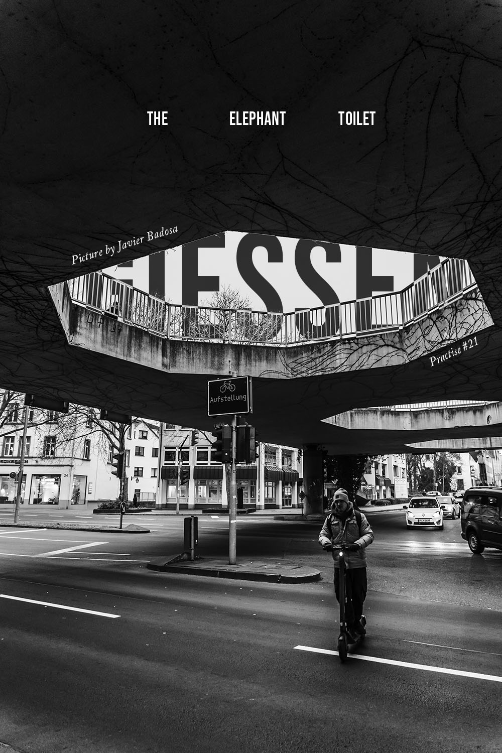
MAGAZINE COVER & SPREAD
One typeface – Different weights
120 minutes
This week was hard to do things.. The course on typography is great and I’m revisiting the content. But I feel that even though I’m getting better at poster design, when it comes to spreads I’m a bit lost. I still don’t know how to use a grid properly for the layout, and overall I’m not sure how to finalize the double page.
I noticed once again the importance of a protagonist, whether is a poster or spread, and the power of the typography you use. I actually didn’t like the typography I was using for this exercise, but I wanted something resembling newspaper or magazines.