Week #16
5th to 9th of December of 2022
Web Blog Post
40 minutes for all version
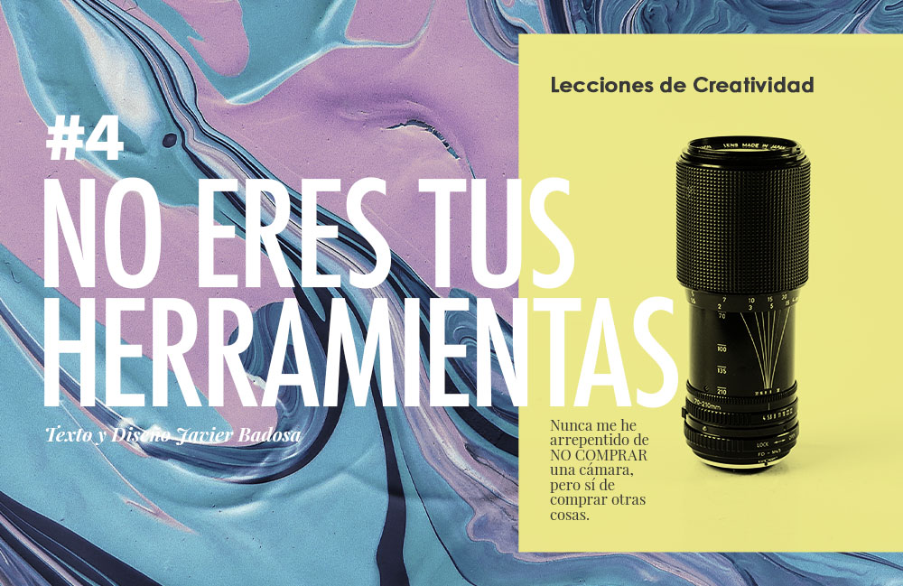
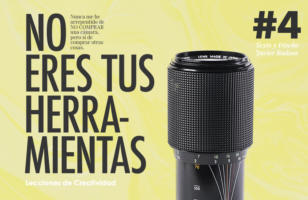
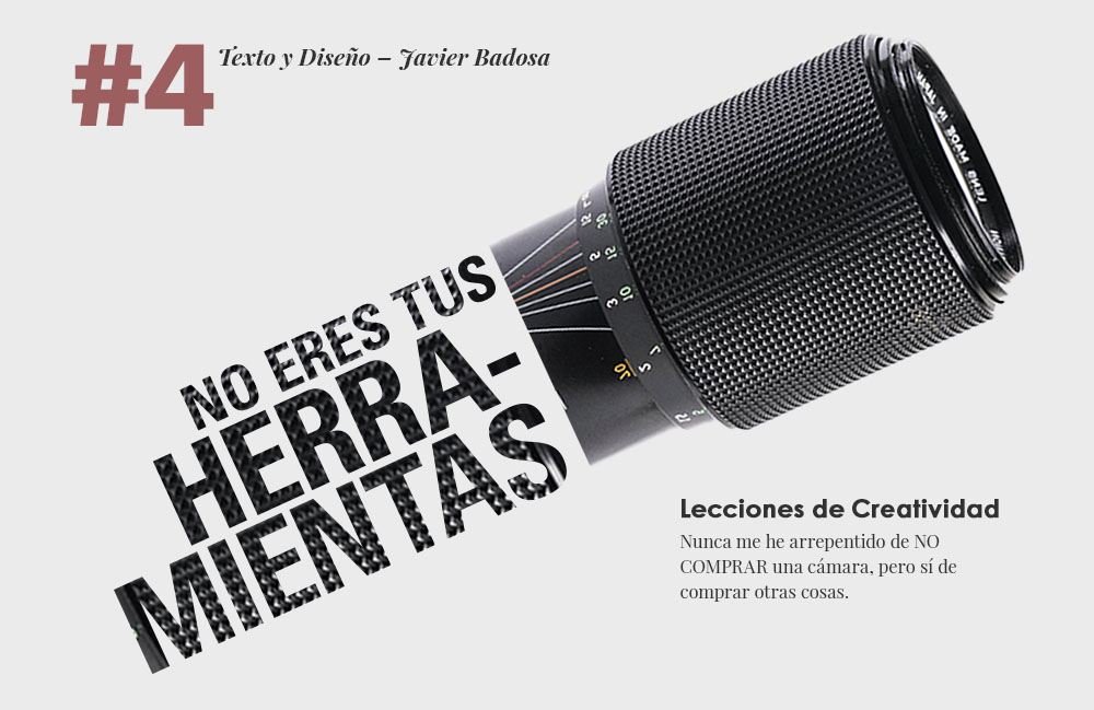
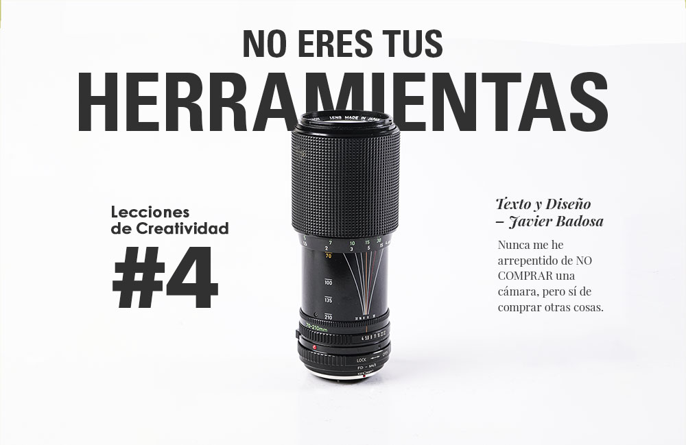
This is a continuation on the exercise of horizontal designs for web. It’s also on the topics that I’m writing about. This was just fun to make. When I get stuck and I don’t know what ideas to do, I just move things around and try to make other designs even if they look bad. Constantly I’m reminded of how important it is to try new things variations when you’re stuck, even if you feel they look bad.
Vertical Magazine Article
35 minutes per version
I want to get better at editorial design, which is usually in a horizontal format. But I’m also interested in testing the vertical format, as a way to make a distinction from a paper Magazine to a screen one.
This exercise made me see again how much I still need to learn…I struggle a lot with structuring well from the start. I need to understand grid systems and designs spaces better and how they relate with each other. I also didn’t know how to do something vertical but not center, so I have to proactise that. In a poster I’m getting better, but when is a different size and format I’m a bit lost.
This text are originally from me, since I’ve been writing articles on the creative process.
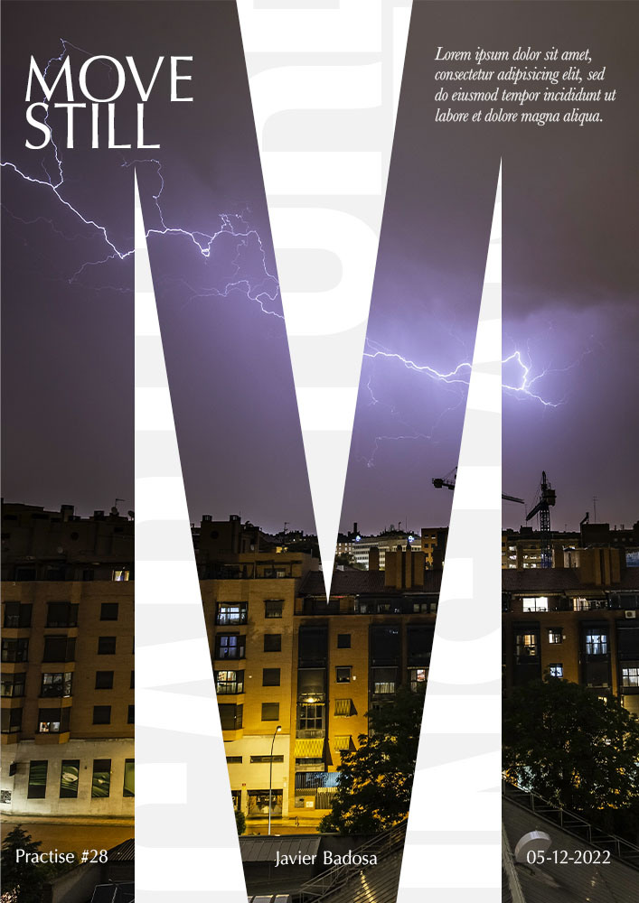
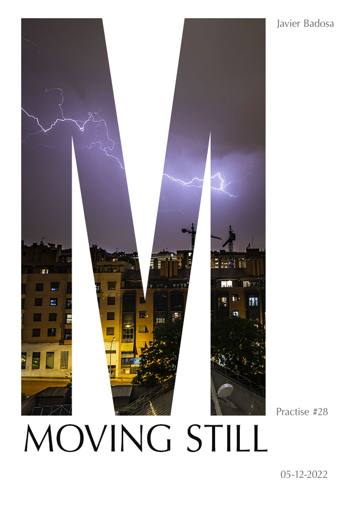
Poster typography test
40 minutes for all versions
This was the first exercise from the week and I’m not so happy about it. I wanted to try the font «optima», and that was interesting, but I couldn’t make the design look good. I think the initial picture was hard to work with in a letter format.
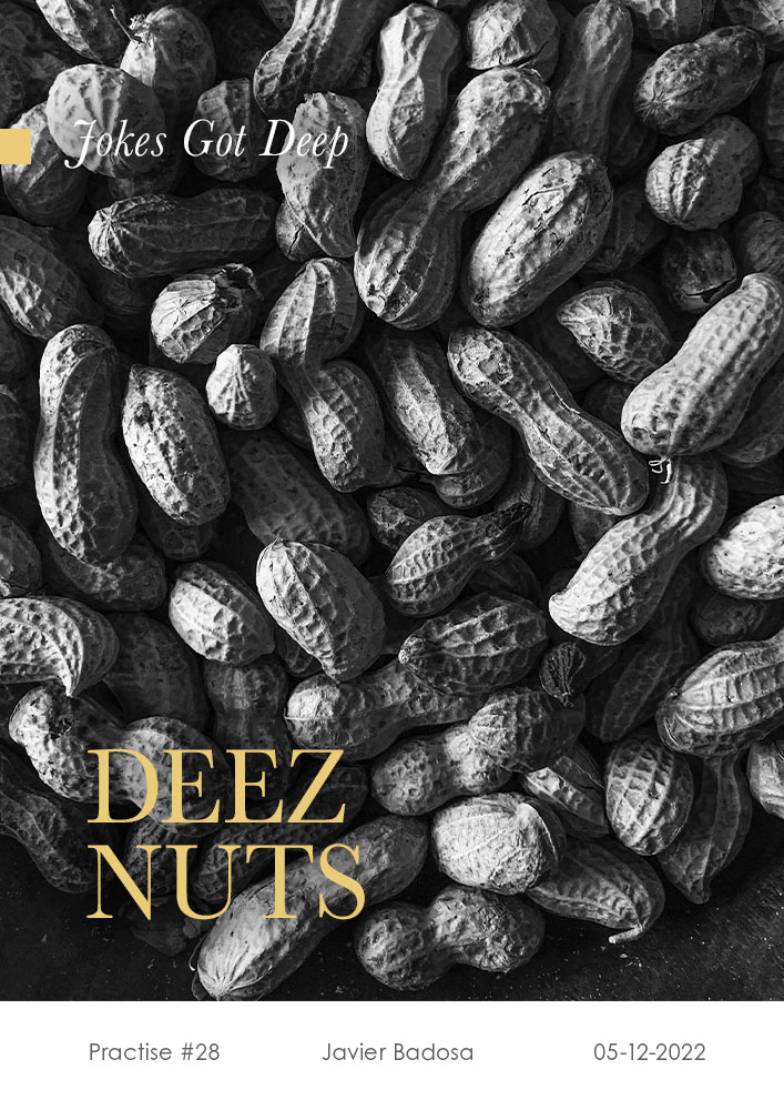
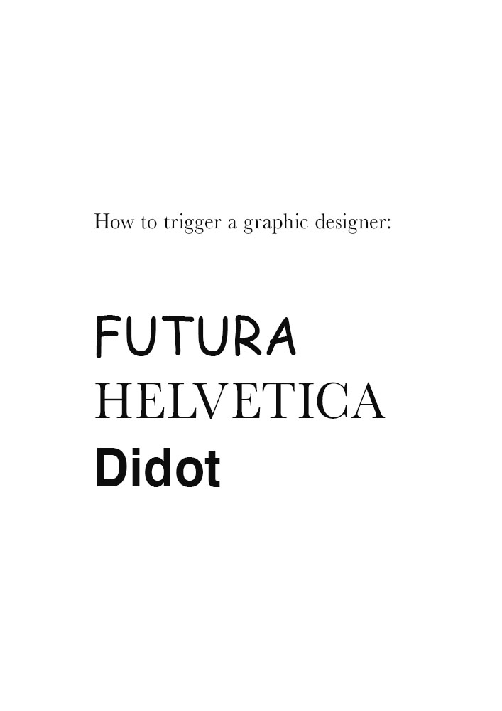
Also forgive my stupid jokes, I don’t know what to write on the text…

