Week #17
12th to 16th of December 2022
Magazine Lay Out
120 minutes for all versions
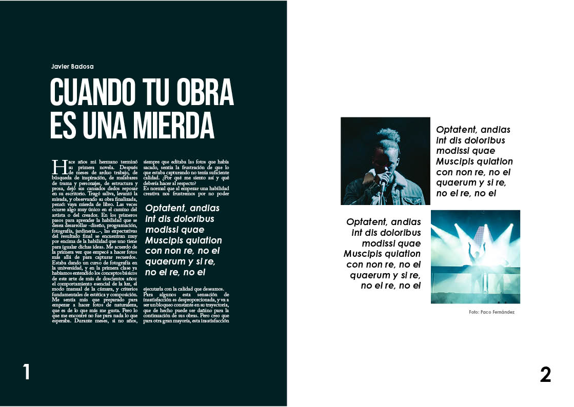
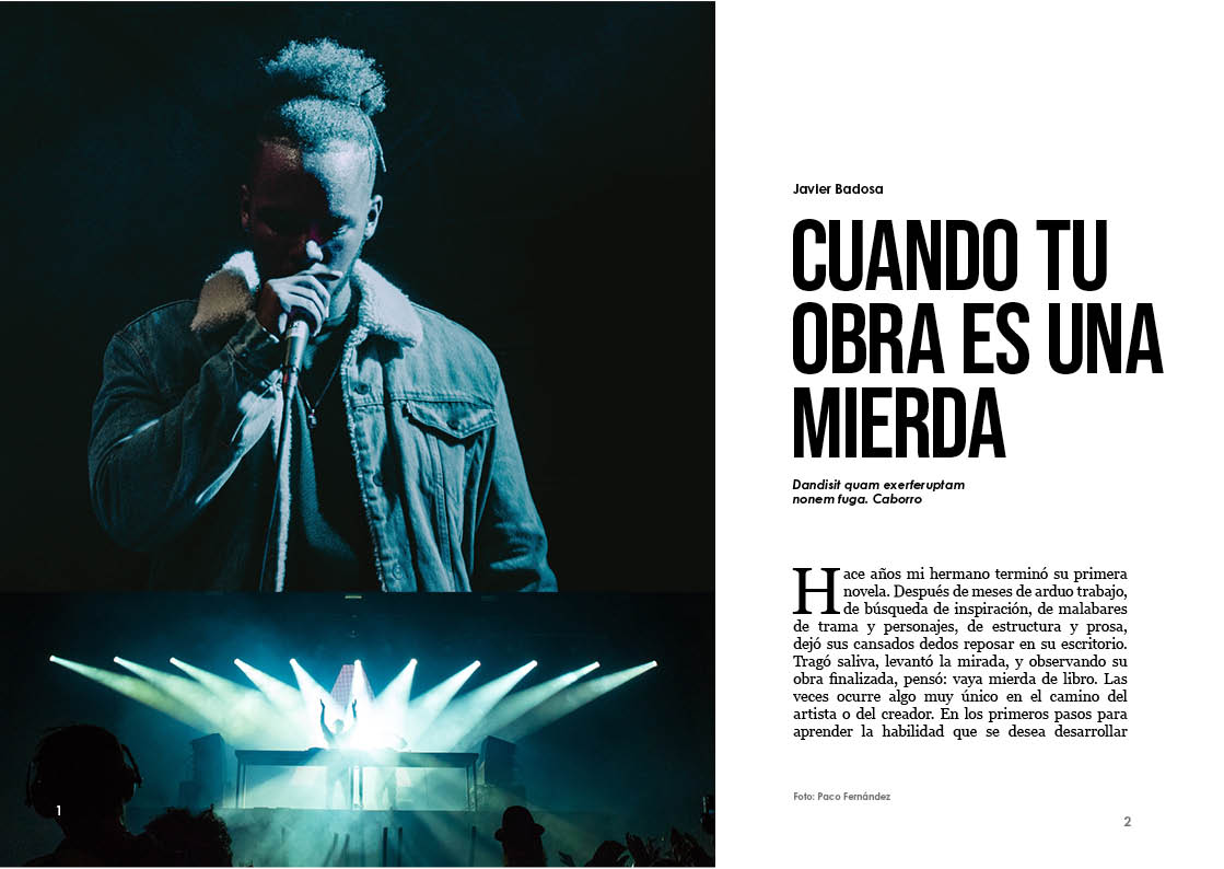
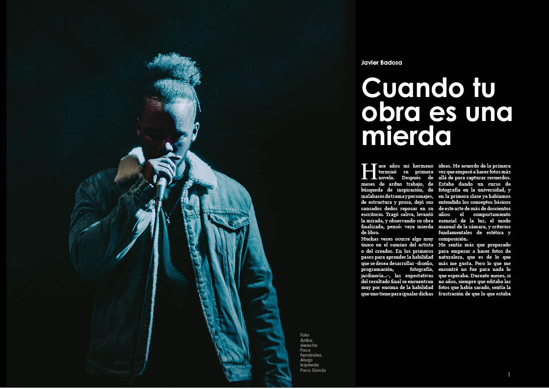
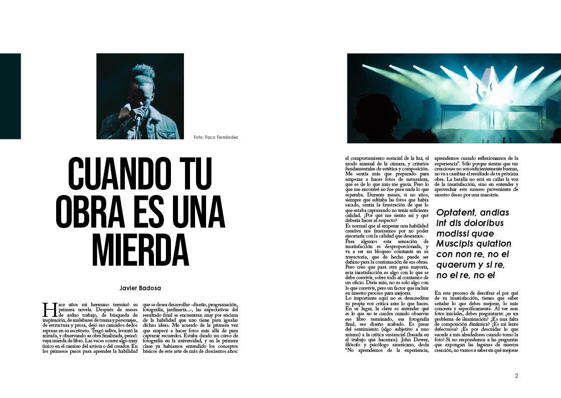
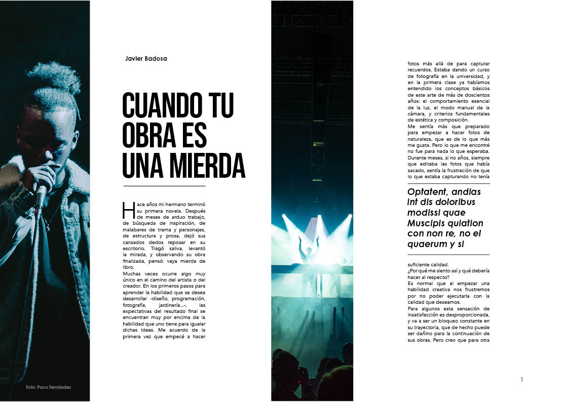
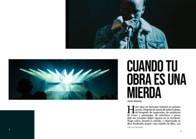
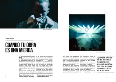
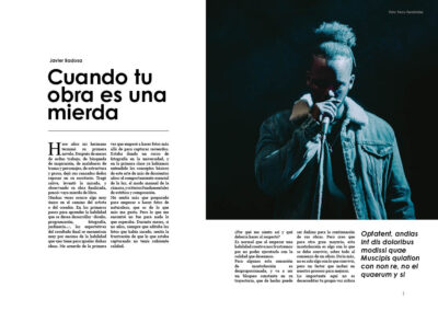
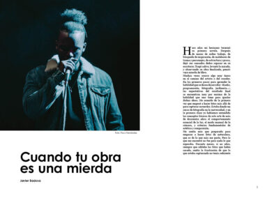
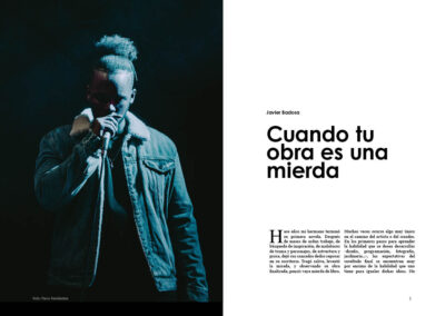
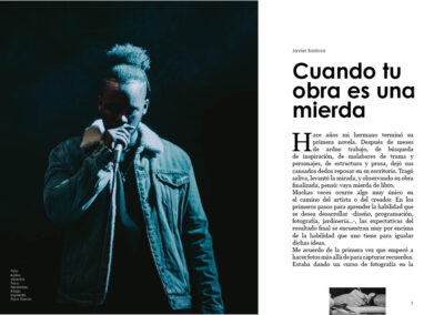
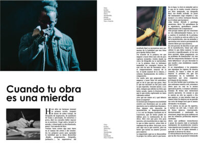
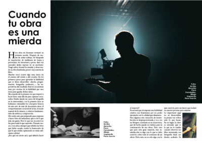
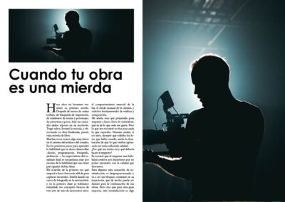
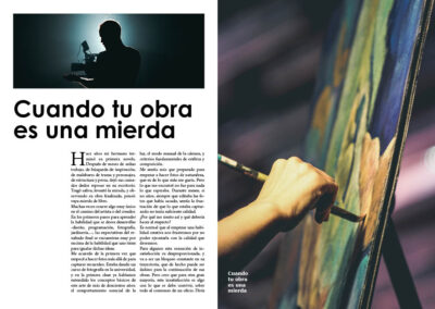
I’ve noticed that I still struggle with horizontal magazine lay outs, and I wanted to practise more. It’s been quite difficult but I think I could internalize some things.
To design a double page is very different than a vertical one page design. Knowing that there will be a limitation right in the middle makes it more complicated. I just don’t know if I should treat the spread as one design or as two, since there will be a natural separation.
I want to continue on this direction, and to practise what’s hard until I get better grasp of it. I think starting with few elements and making it progressively more complicated is the way to go.

