WEEK #3
5th to 9th of September
1500×500
In this exercise I could only use 1 image and the 2 lines of text: the title «A Closer Look» and subtitle «Exploring design through everyday objects».
The format was also interesting to explore: 1500×500.
I’m still at a stage that I want to work on the composition without getting into colours and shapes too much. I think the real of text and image is already enough ground for me to work on.
Also I’m trying to avoid symmentrical compositions, since that’s the easiest and default that I have. Trying to make things ballance in different ways, for example applying a Synamic Simmetry grid.
I really enjoyed this exercise. I could do 5 concepts in barely 40 minutes, which makes me think that the theory and exercises are making me more visually sensitive.
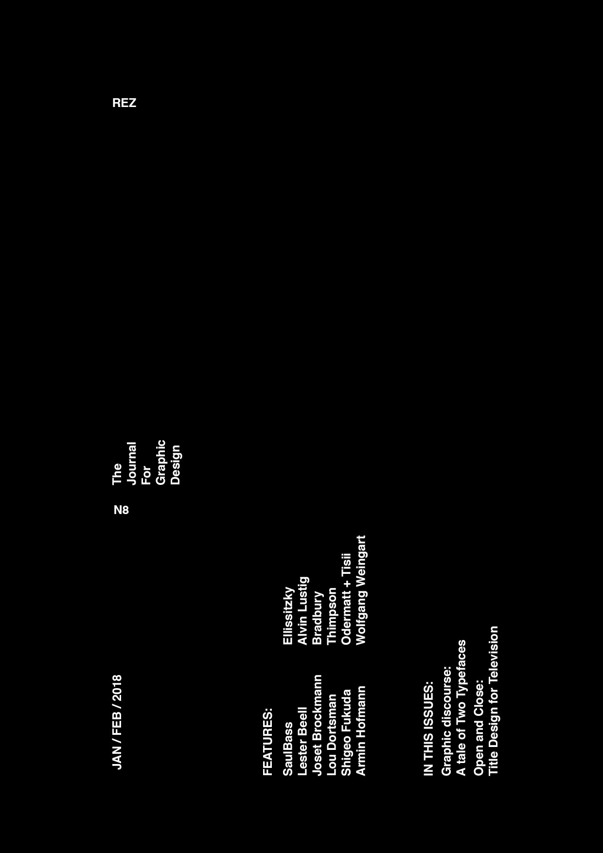
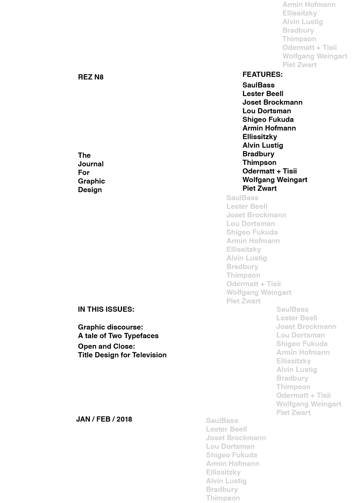
THE FUTUR SERIES #1
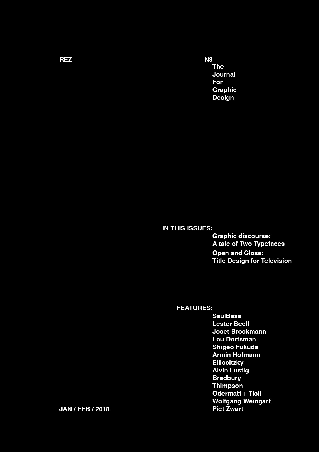
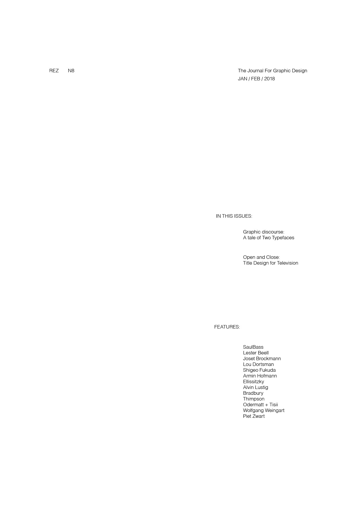
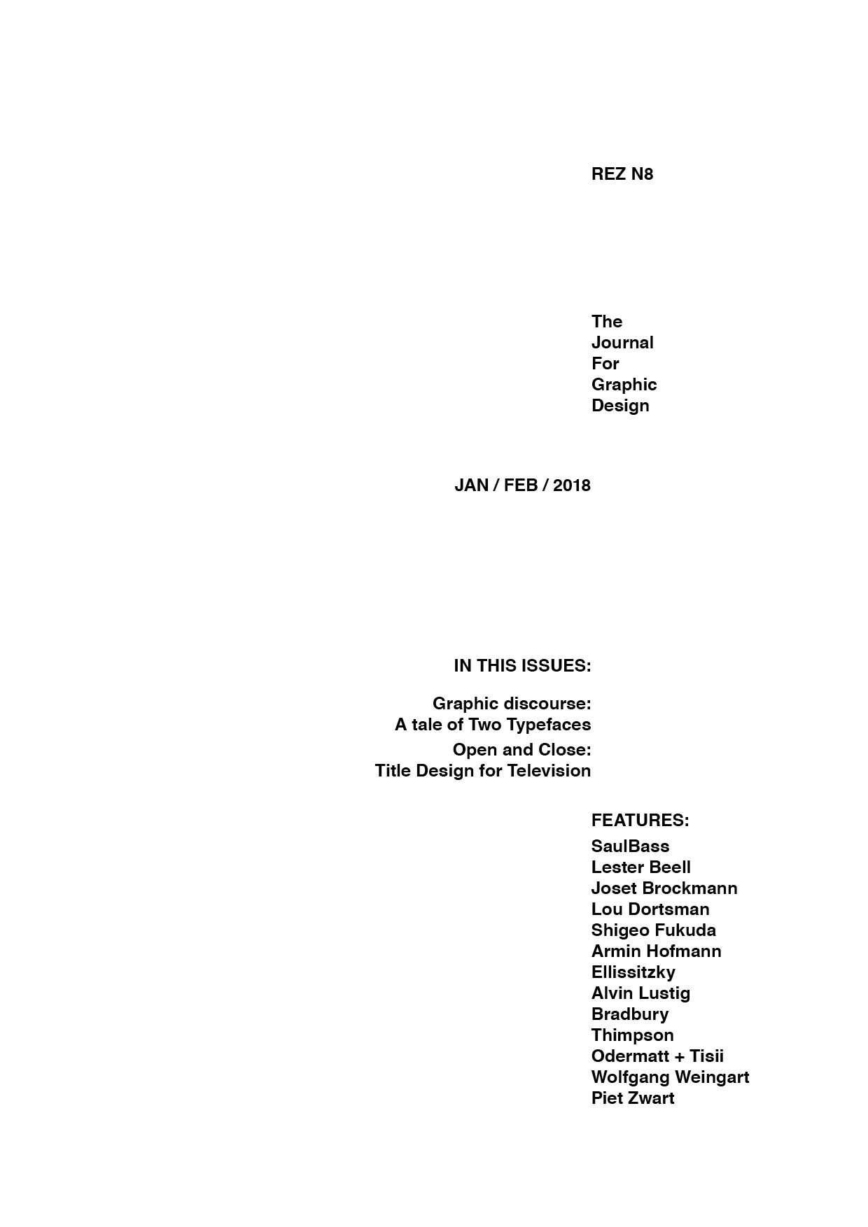
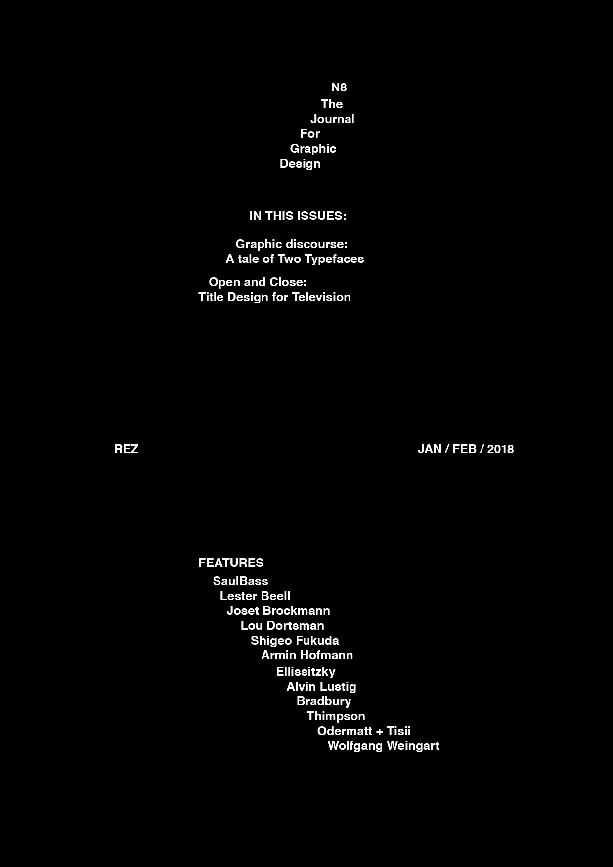
Exercise from the youtube channel The Futur. The idea of the series is to start designing with one element (font) and then build up from there.
In this first exercise you can only use one font (Helvetica) with the same point size.
This was very helpful to hear the feedback that Chris Do is giving to the students summiting the designs.
I realized many things with this exercise: how much relationship negative space / blocks of space have with each other, and how to take that into the advantage of more dynamic compositions. Also I had an «Eureka» moment of noticing how much a design change with it’s details. It sounds basic in arts, but it just gave me the sense that the possibilities are infinite and that I just need to be aware of the elements that makes the combinations work better than others.
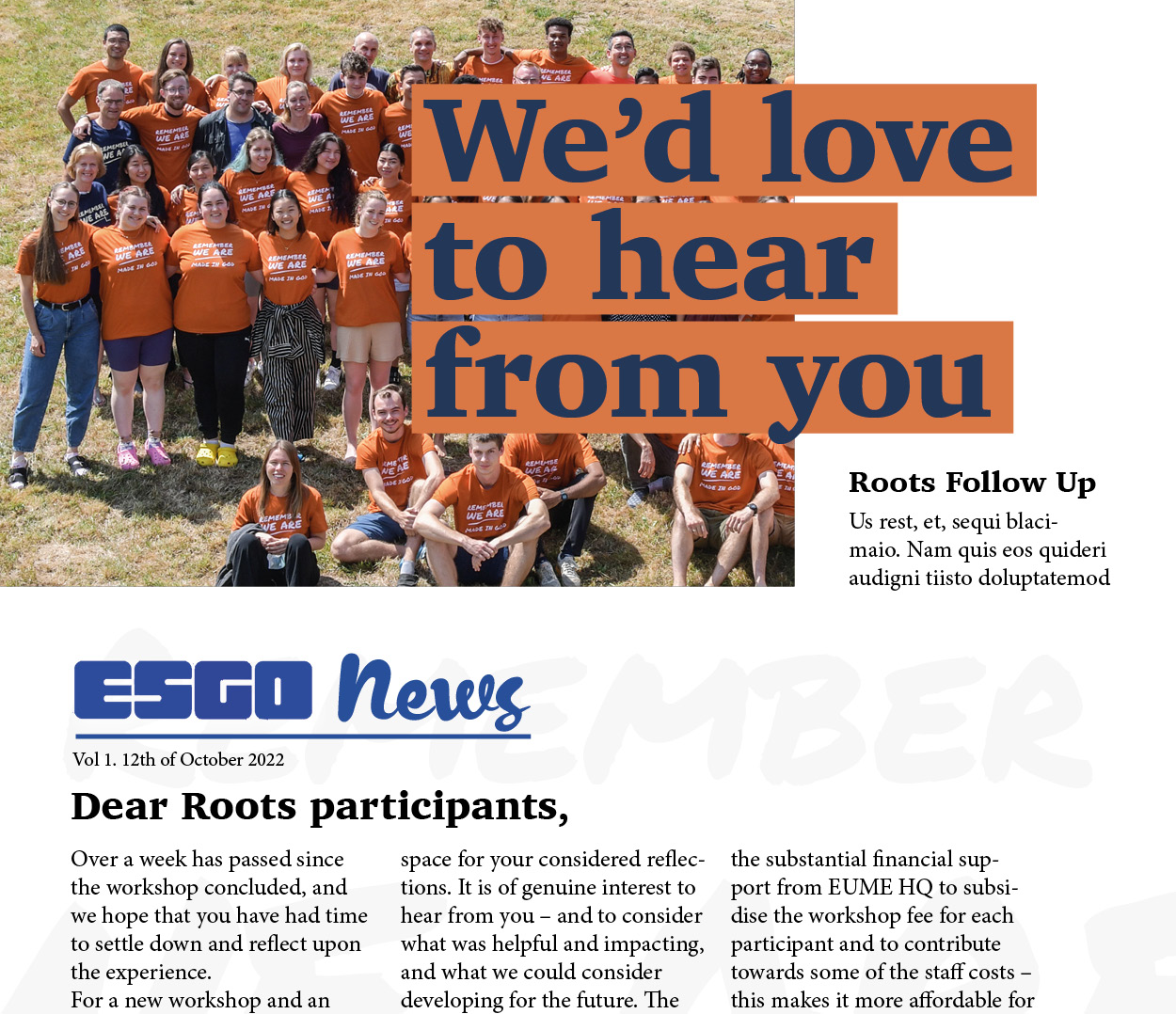
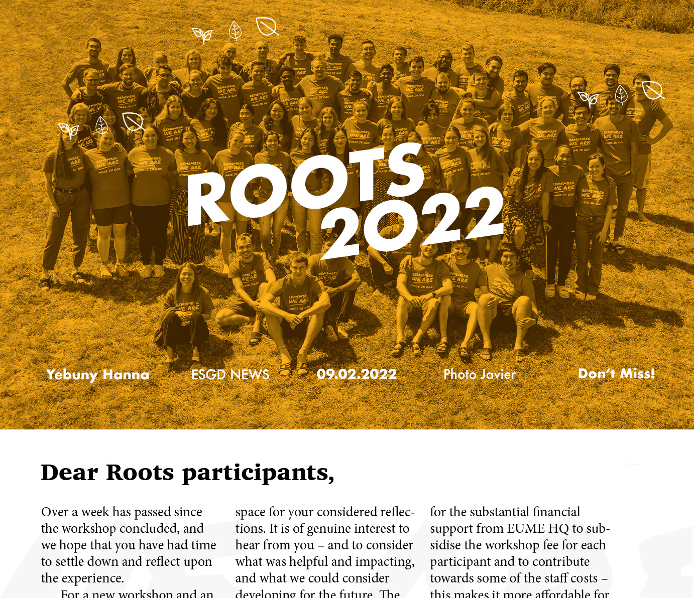
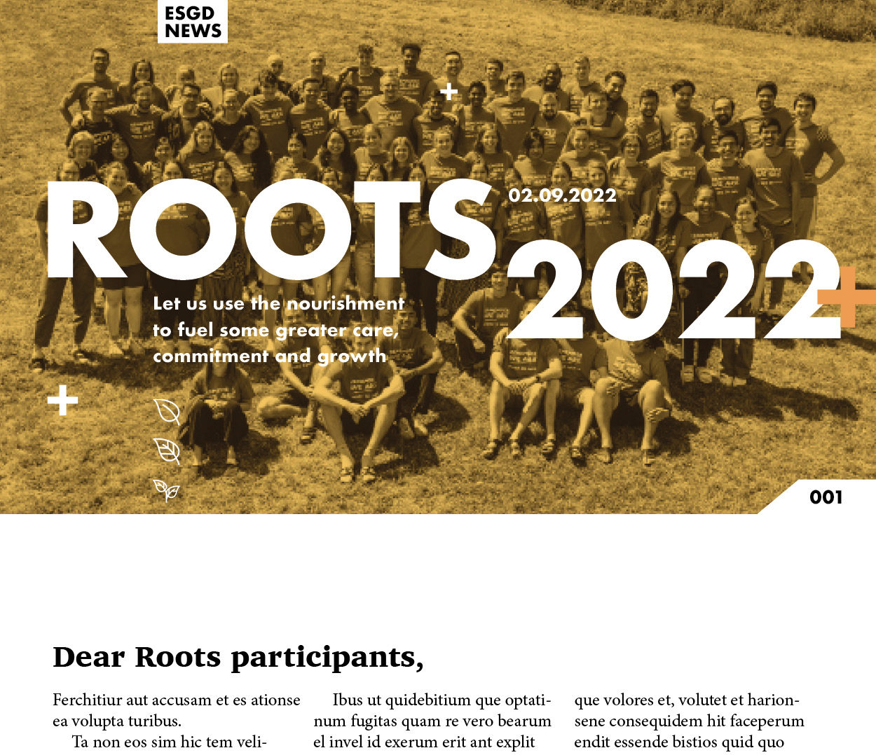
CRAPPY NEWSLETTER
This is a Newsletter Header that I’m struggling with. I think the problem is that the picture is so symmetrical and it doesn’t allow me to explore more dynamic compositions.
I’m not happy with the results that I’ve been wrestling with it and I think it’s worth showing.
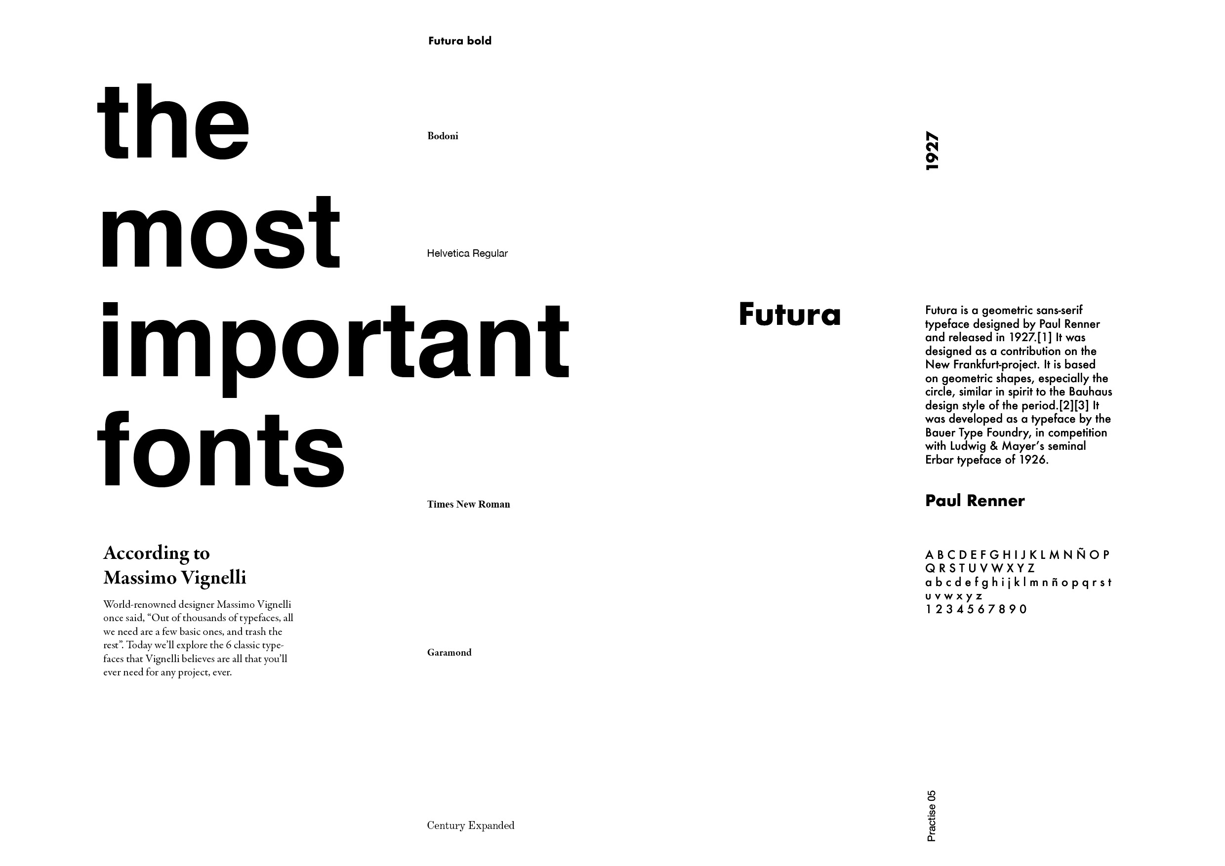
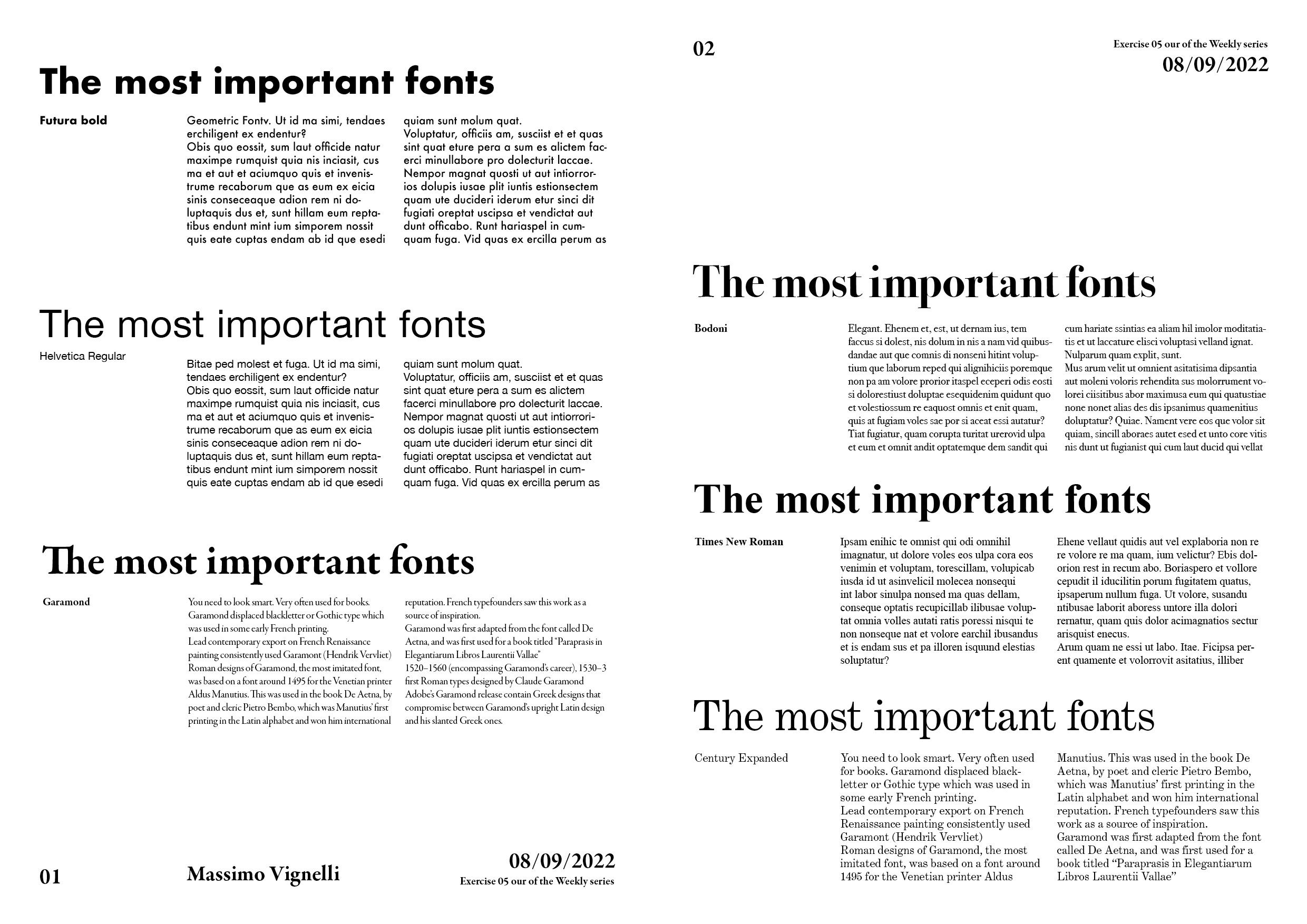
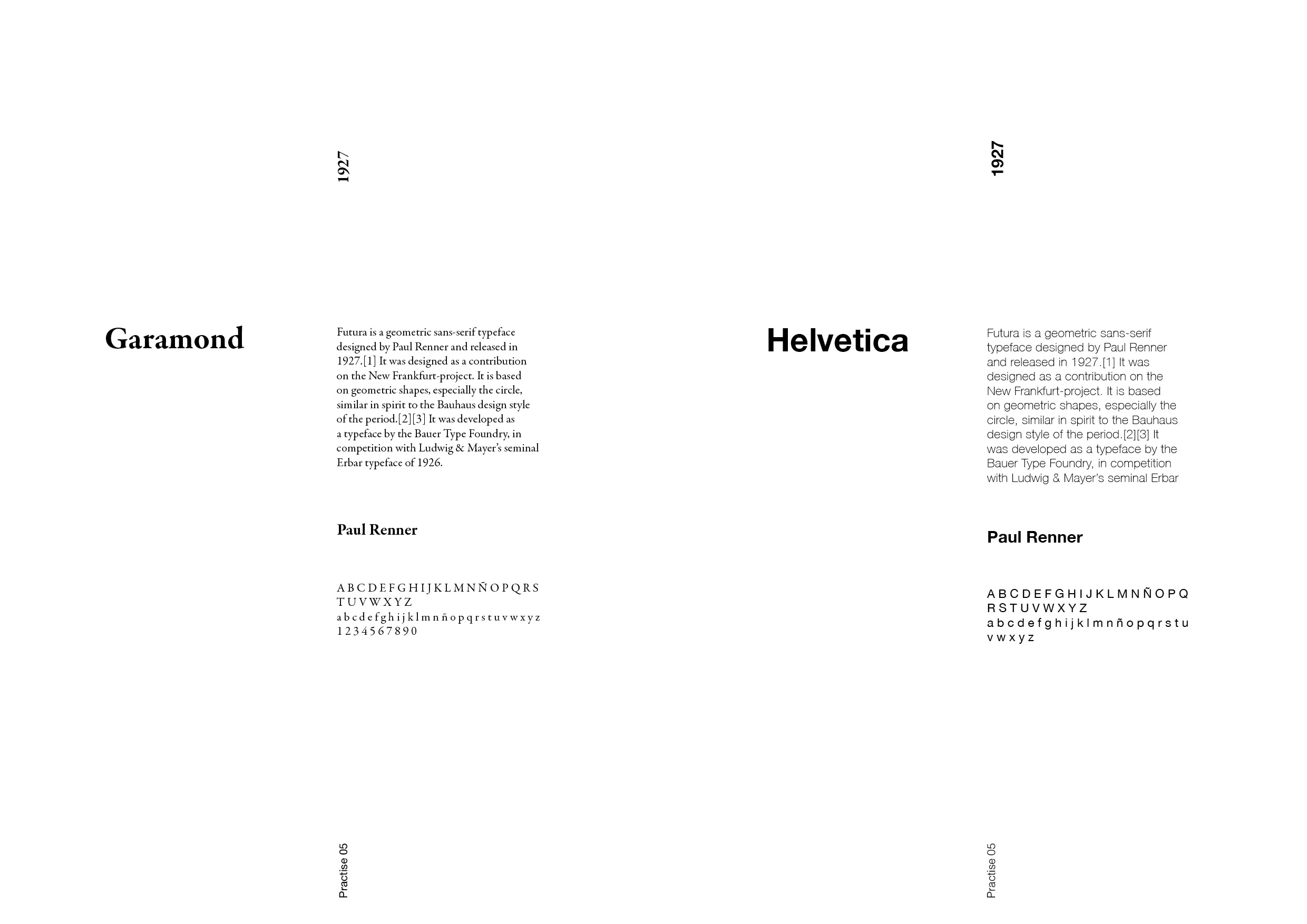
THE MOST IMPORTANT FONTS
This is an exercise I made myself. I wanted to learn more about the basic fonts that I should be familiar with. I discover a very helpful video from Flux Academy
From this content I wanted to try some visuals to remember those fonts and at the same time practise my layout.


