WEEK #4-5
12th to 23rd of September
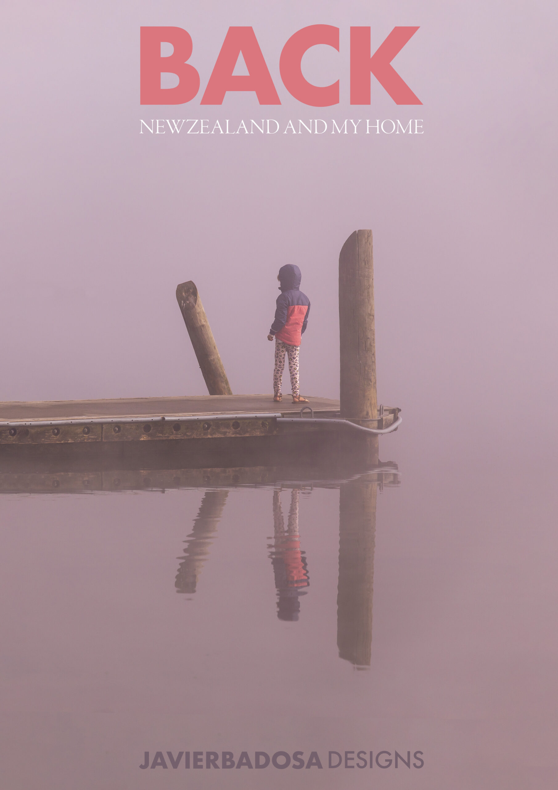
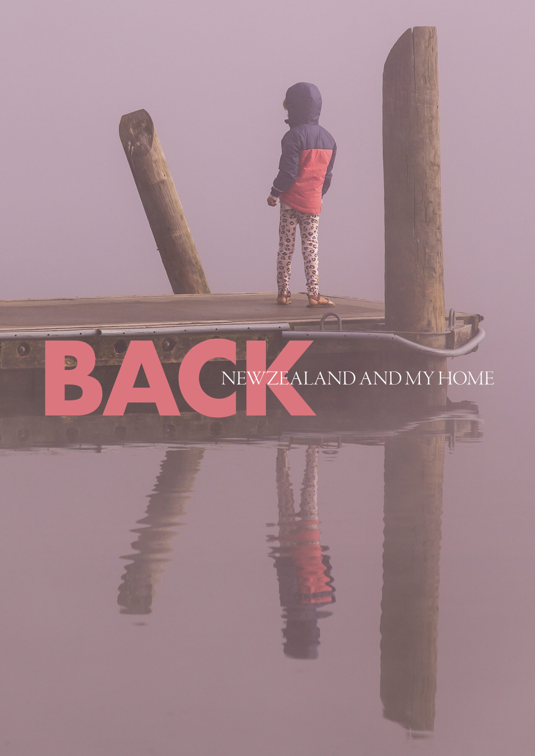
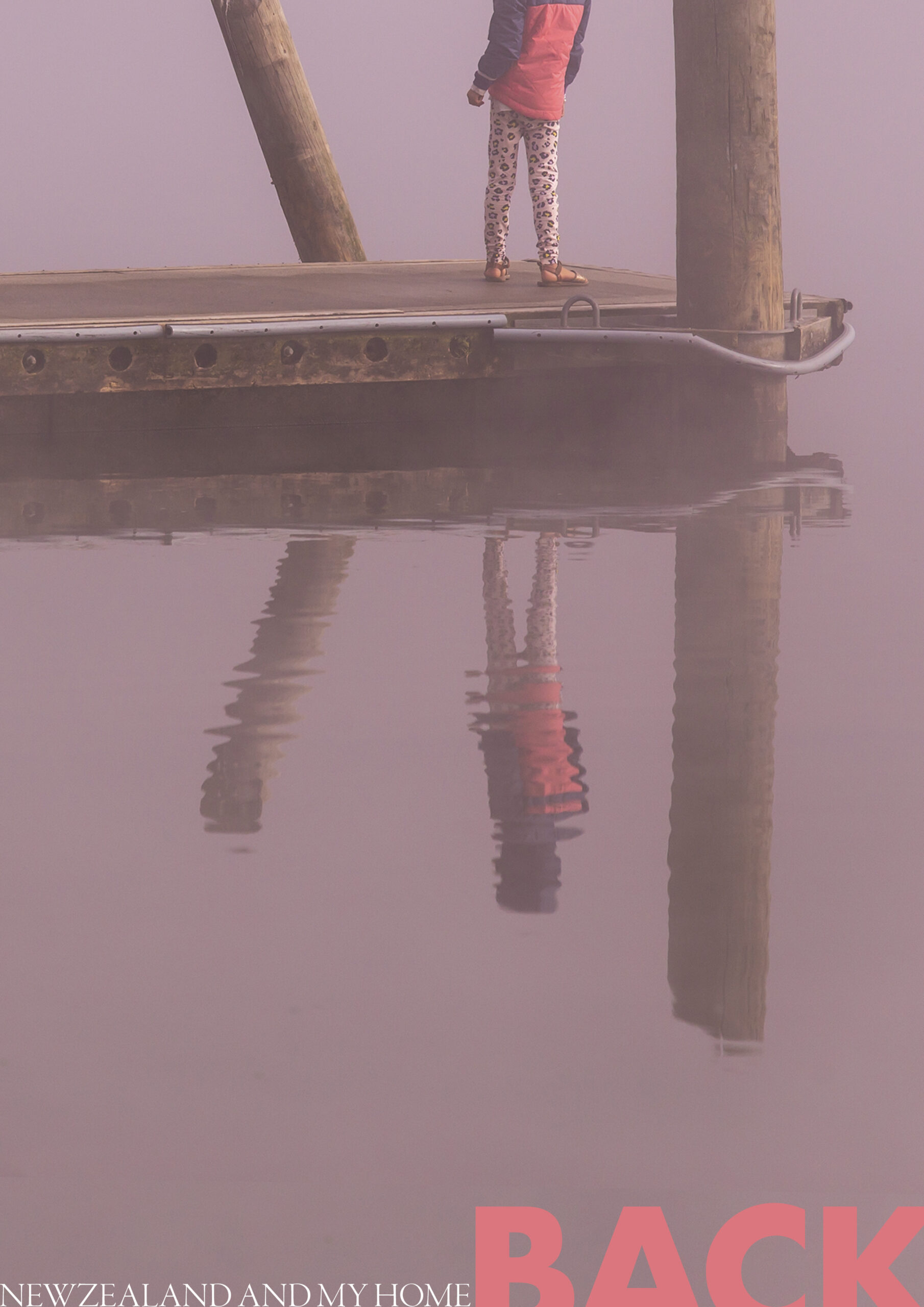
MAGAZINE POSTER TEST #1
I want to learn how to mix photography and text. Cover magazines has always attracted me, and I would like to develop a skill on it.
While researching and seeing examples (1, 2), I noticed that it has to be clear what is the focal point, the protagonist: is it the text or is it the picture? In that sense the selection of the picture will determine the dynamic of these 2 dimensions.
So at the beginning I was using a picture that felt already complete by itseld, with not much negative space, and not really the need of more information in order to create an impact (landscape). I looked for pictures with people in them, and started playing around with that. I think understanding the ballance of image and text, and the good selection of the picture and the words will be the first step on this process. And then making a cohesive relationship between these two: colour, shape, style of the font, alignment…
I still would like to find some tutorials or courses on this, I feel by myself I will be skipping a lot of important theory.
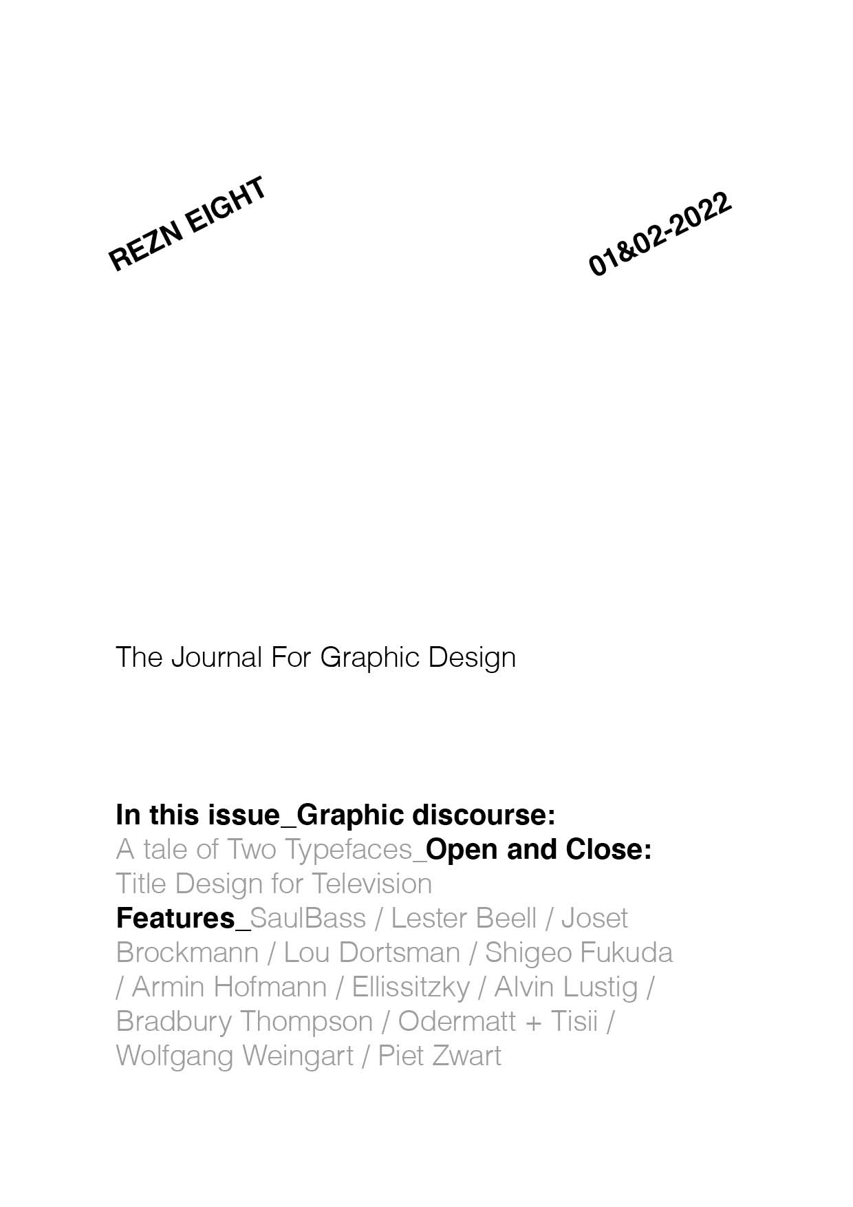
THE FUTUR SERIES #2
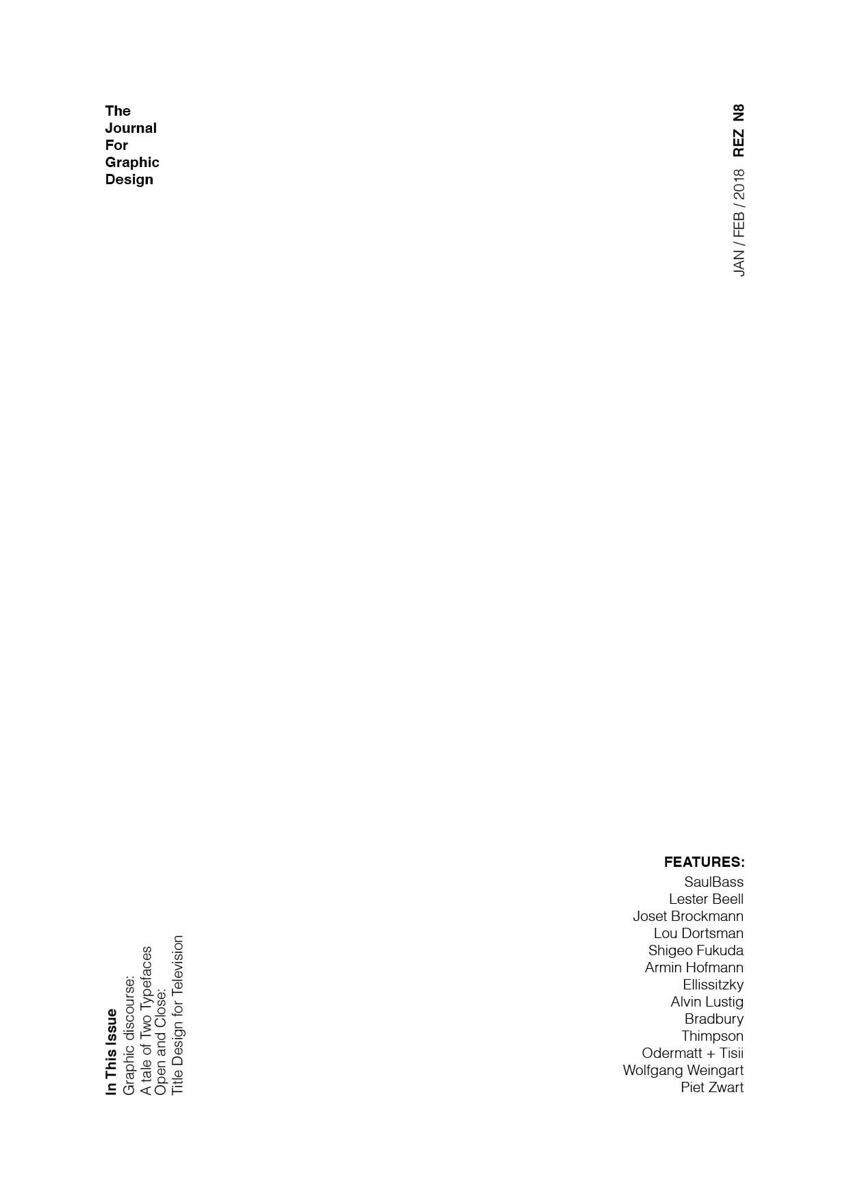
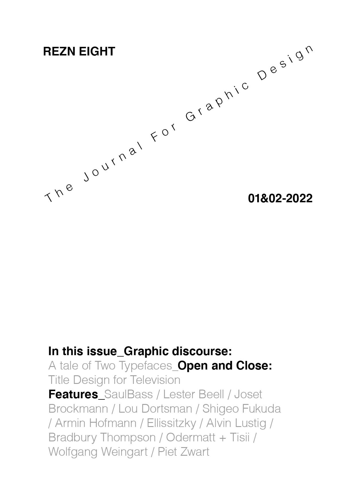
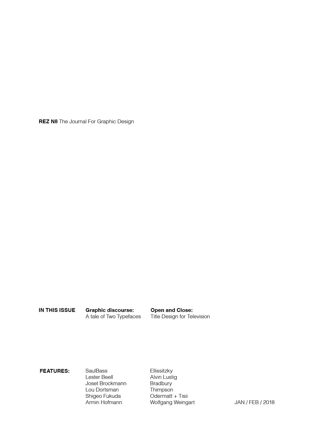
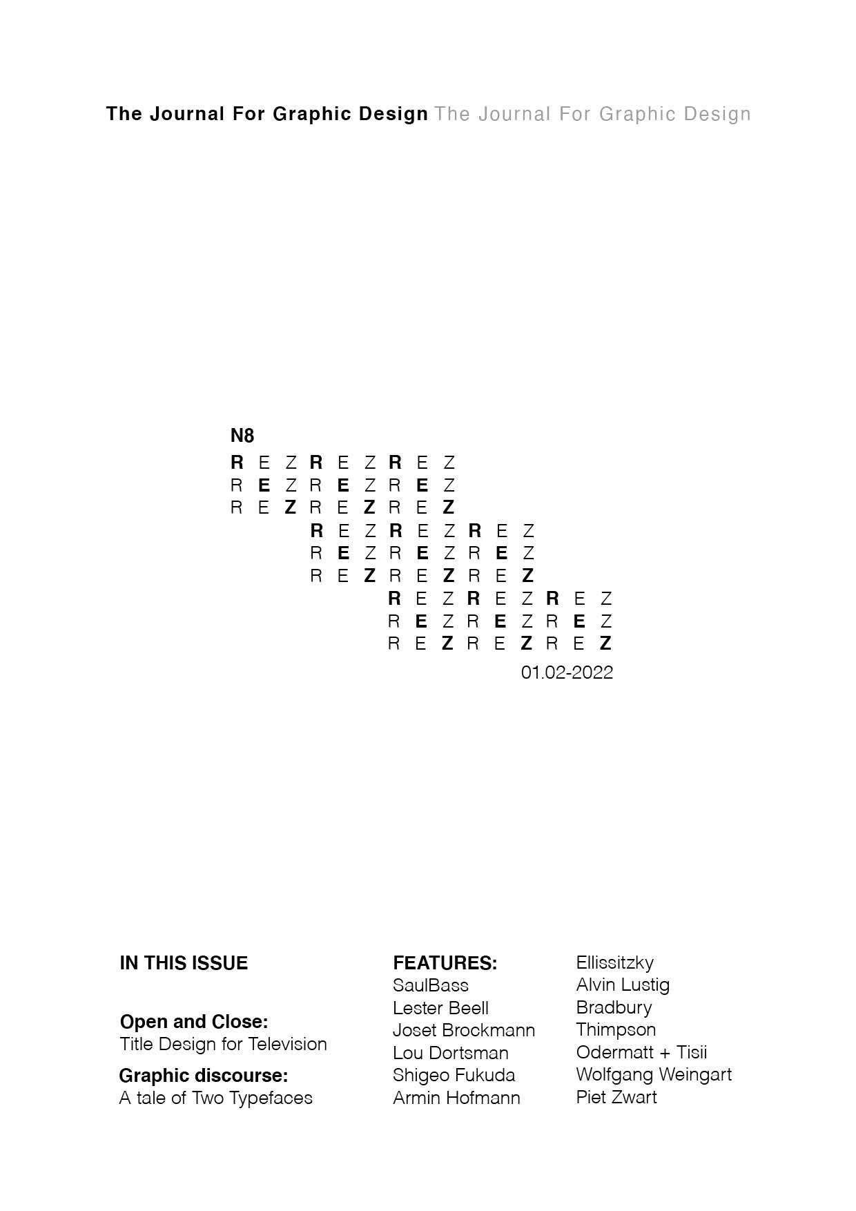
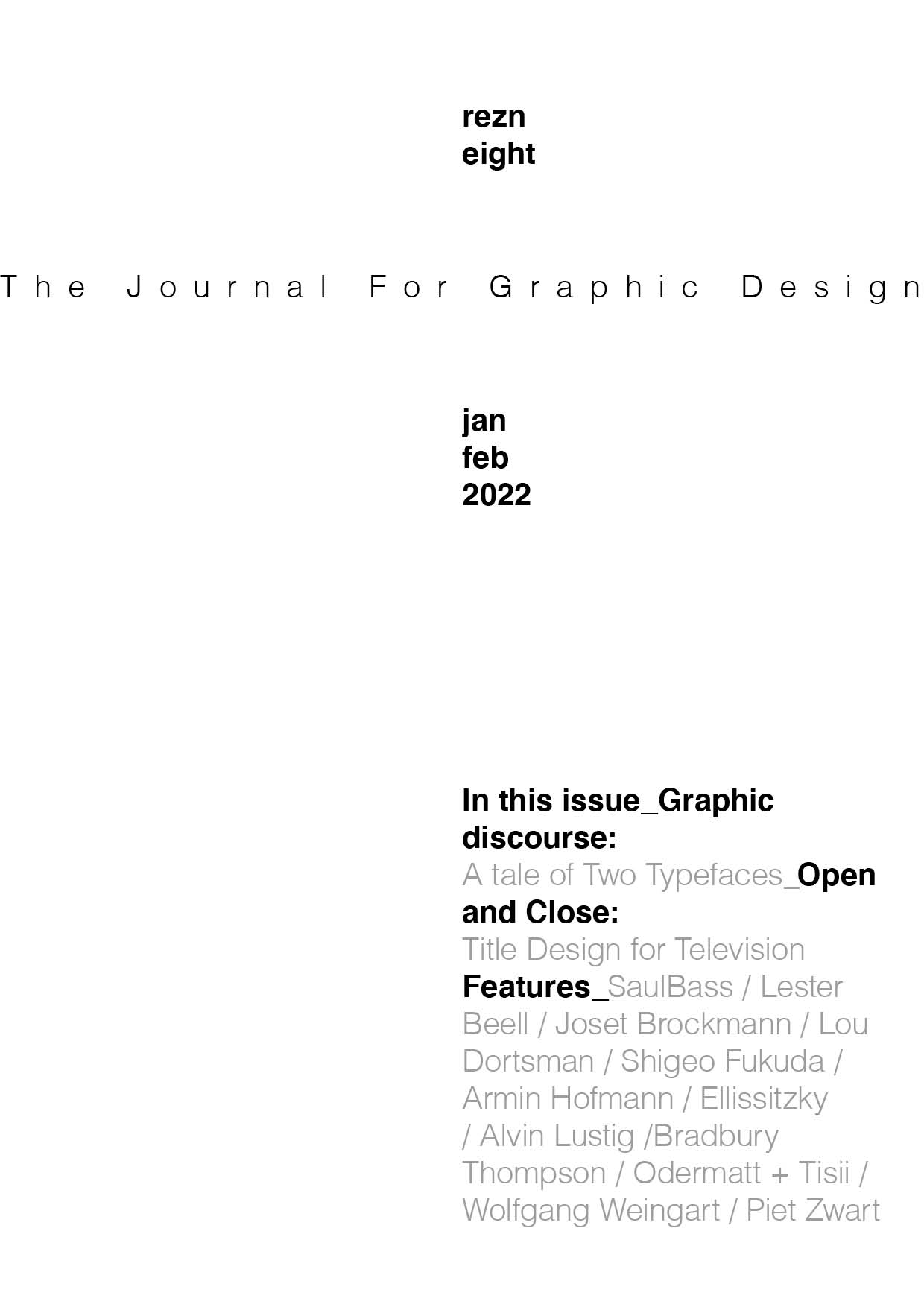
Exercise from the youtube channel The Futur. The idea of the series is to start designing with one element (font) and then build up from there.
In this second exercise you can only use one family font (Helvetica), 2 types but with the same point size.

