Week #41
3rd to 7th of July
RE-generation branding
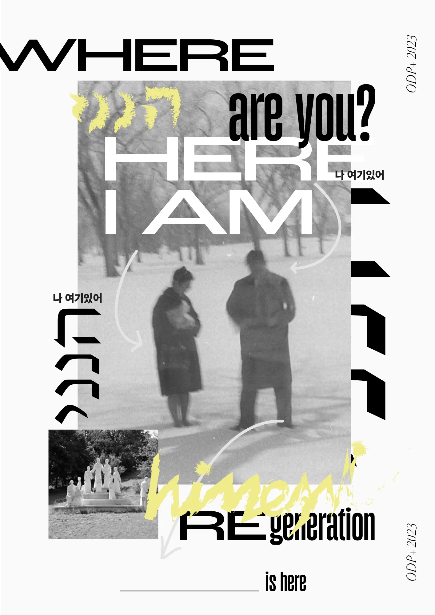
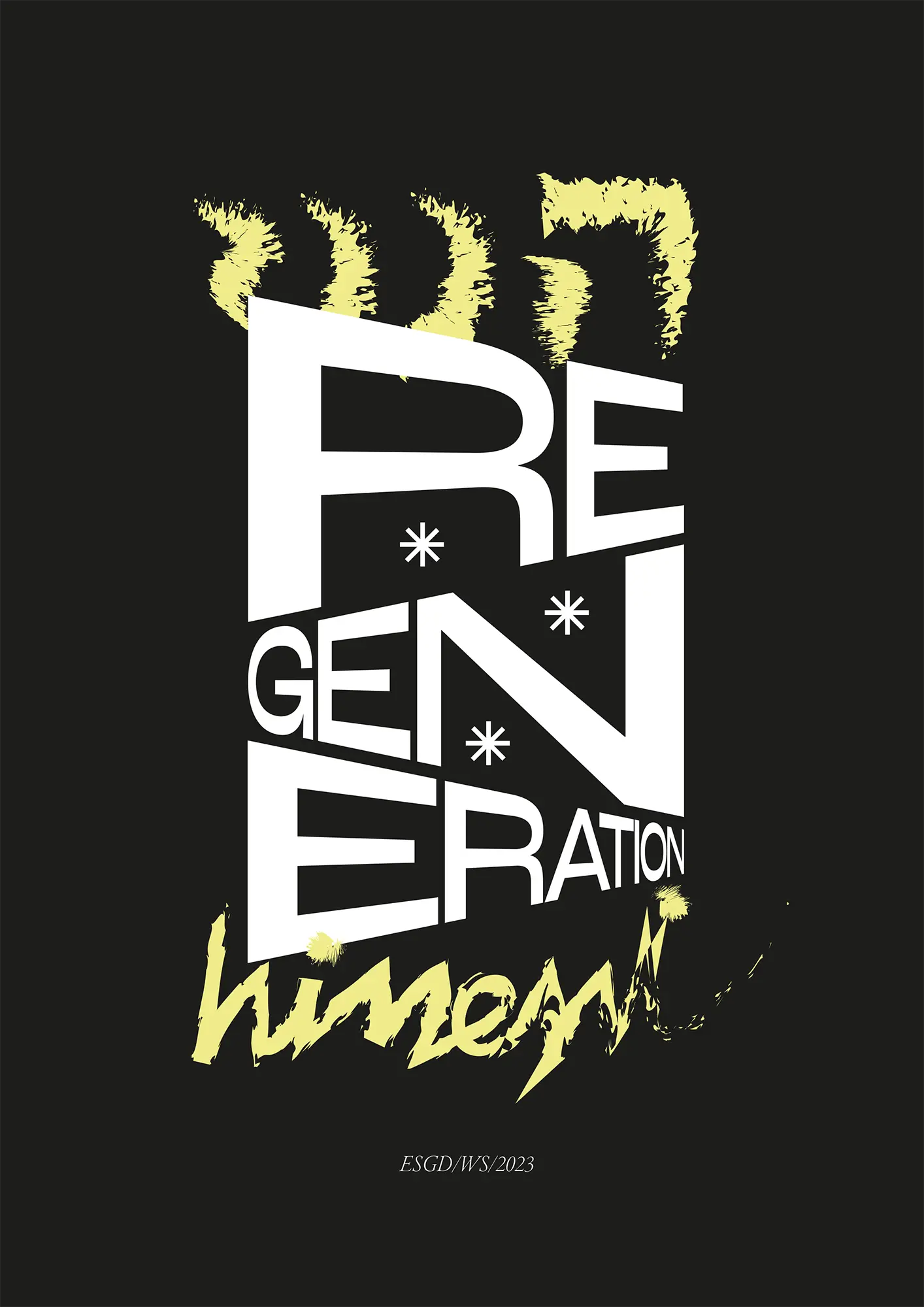
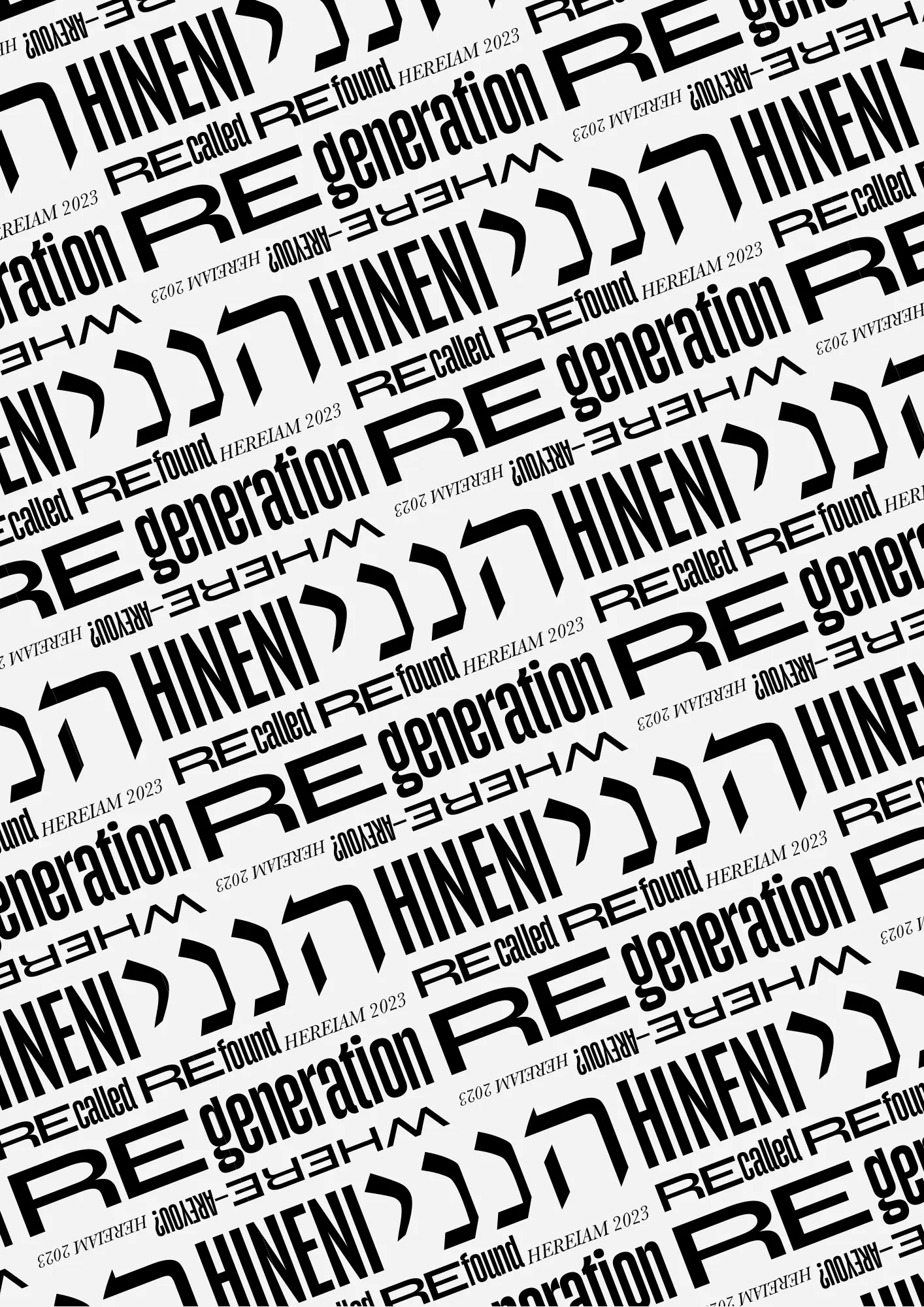
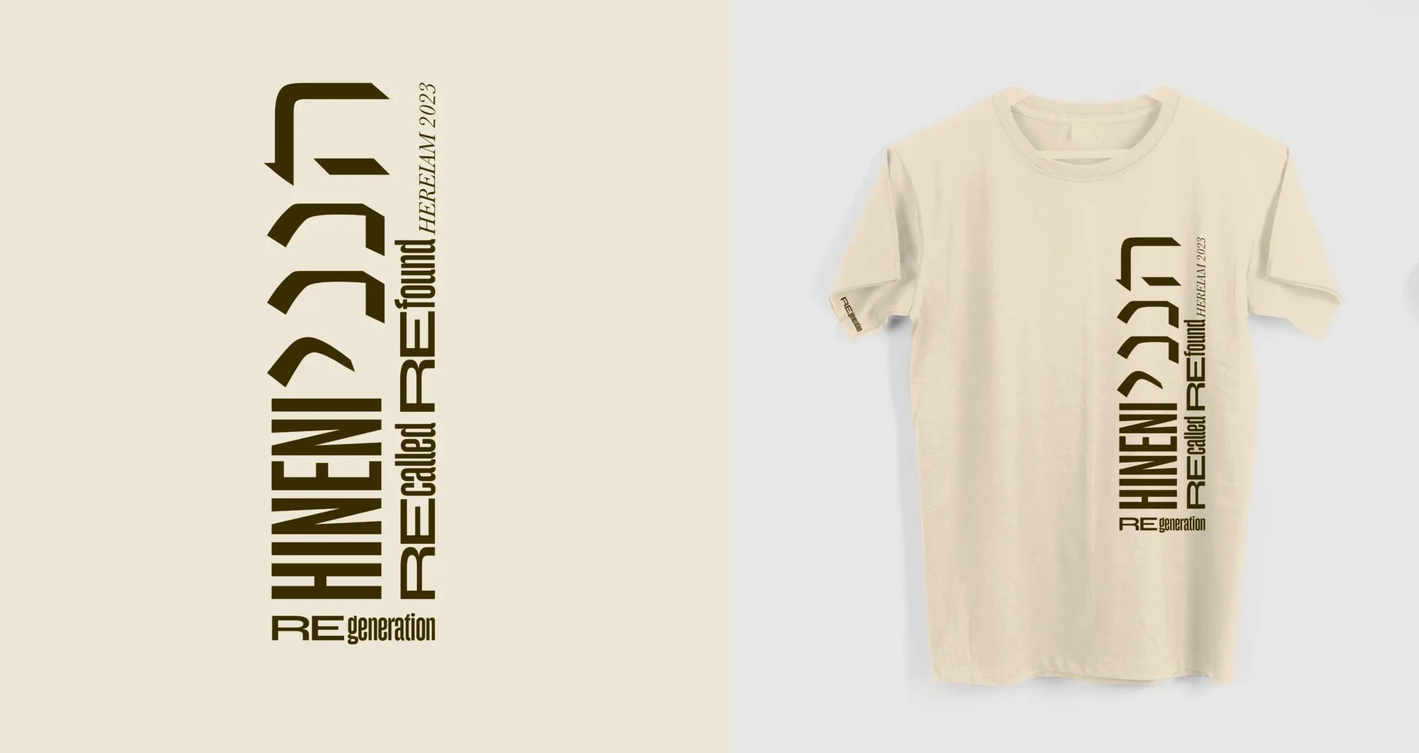
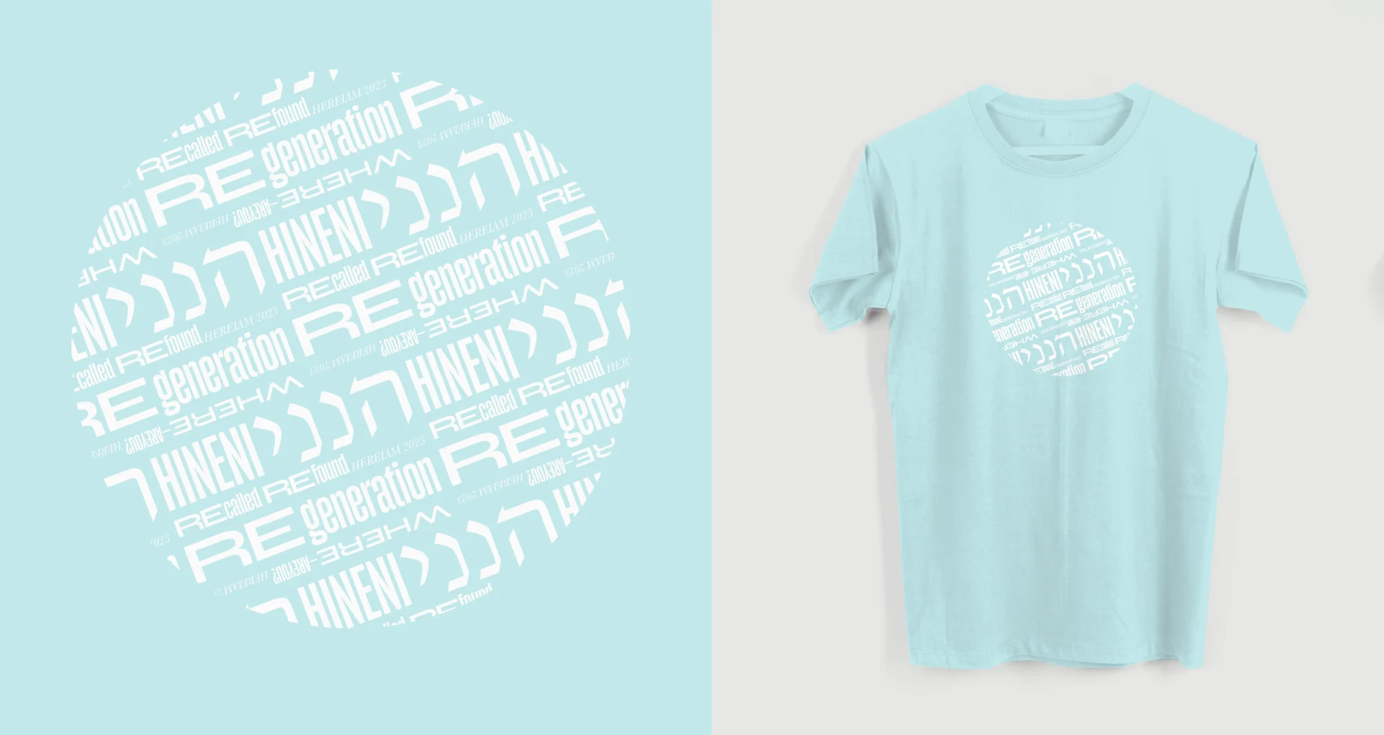
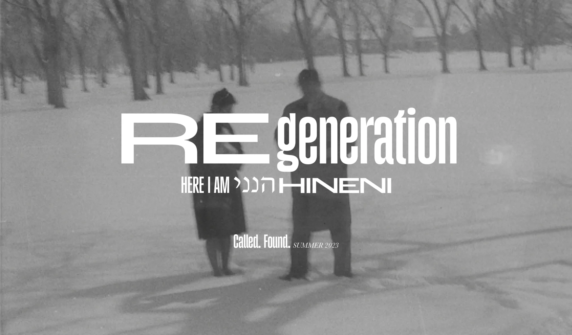
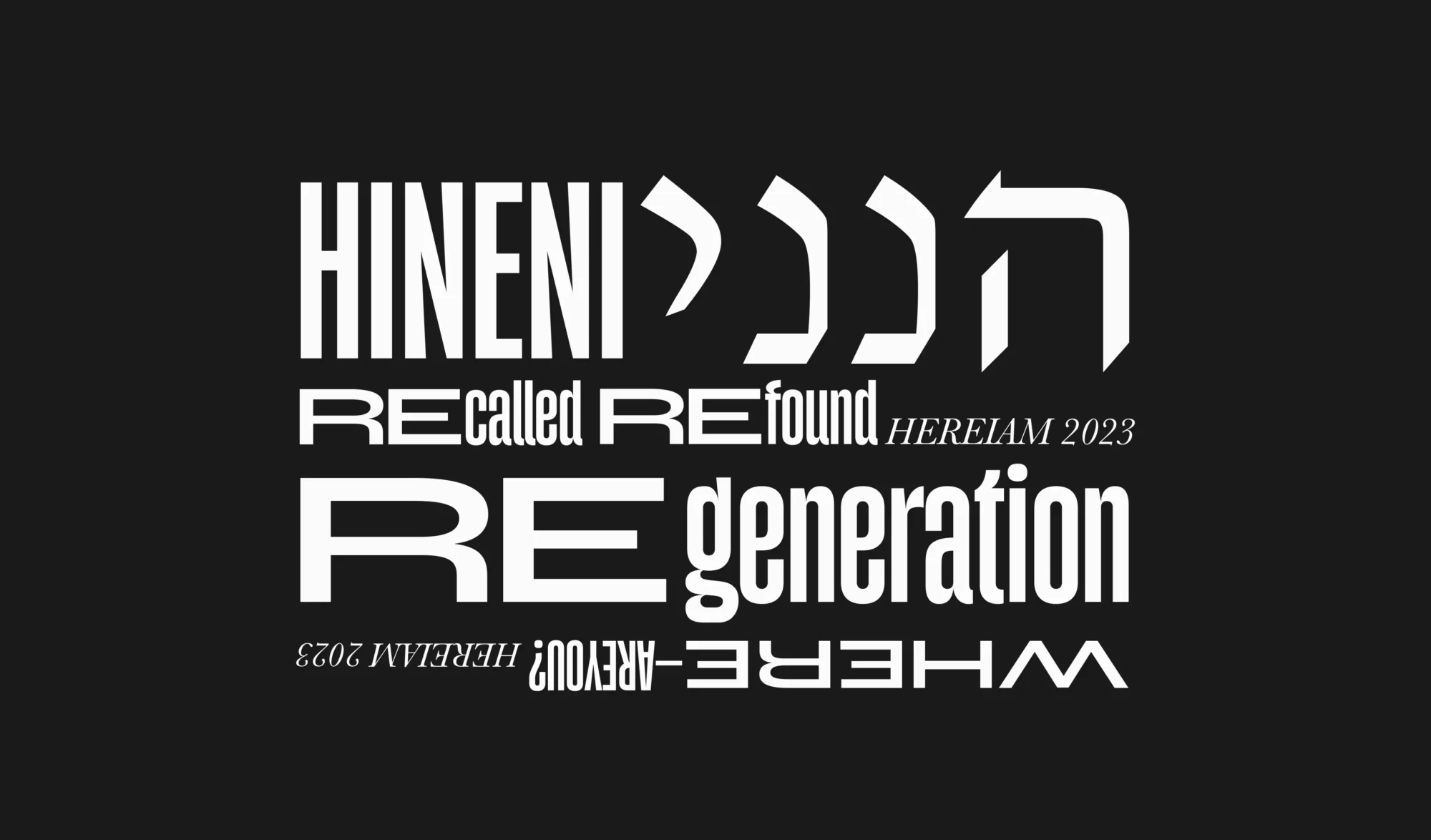
This was such a journey. Finally I could have some real case scenario where I could solve with graphic design the problems of my client. Basically I had to develop the aesthetics for a workshop from a religious group. This included: the logo, two shirts, banners, and a poster.
It took me a while to find the style, but finally I went for a typography based imaginery, also since I’m not a good illustrator (yet?). Once I could find the core idea, mixing two fonts for RE-generation, then everything started rolling. Of course those two fonts are the ones I’ve been using a lot lately: Roc Grotesk and Gazzetta.

