WEEK #6-7
10th to 21st of October
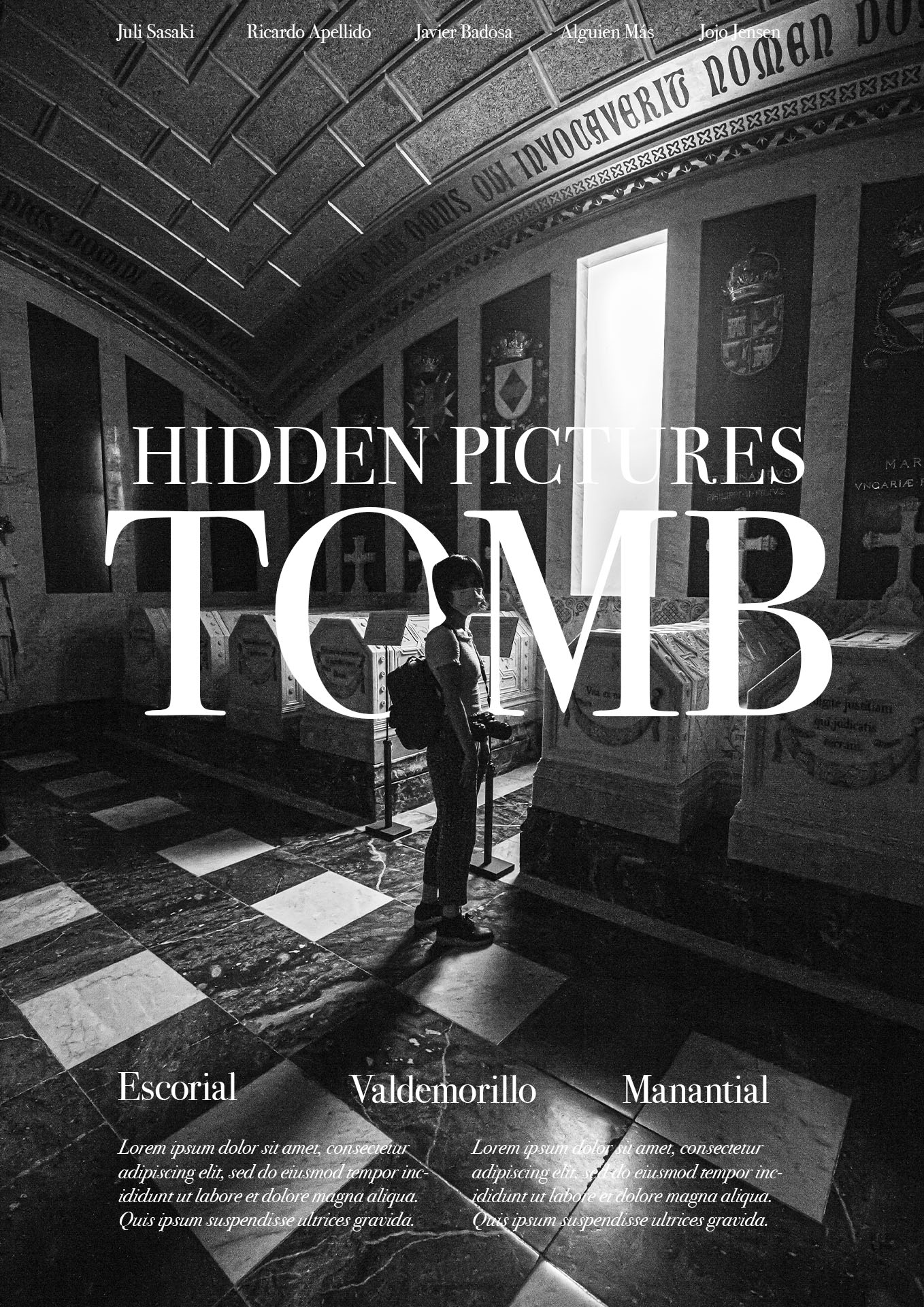
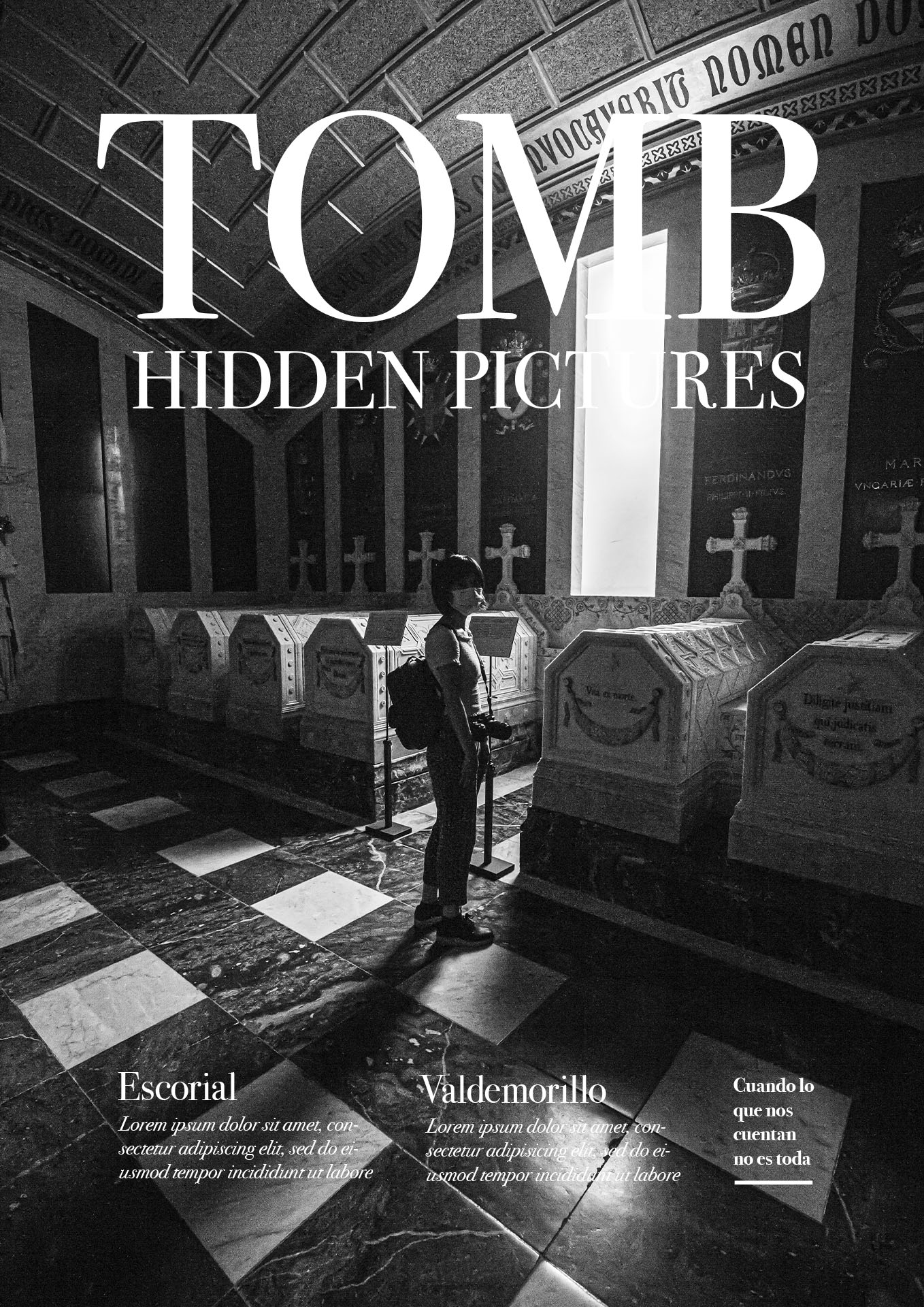
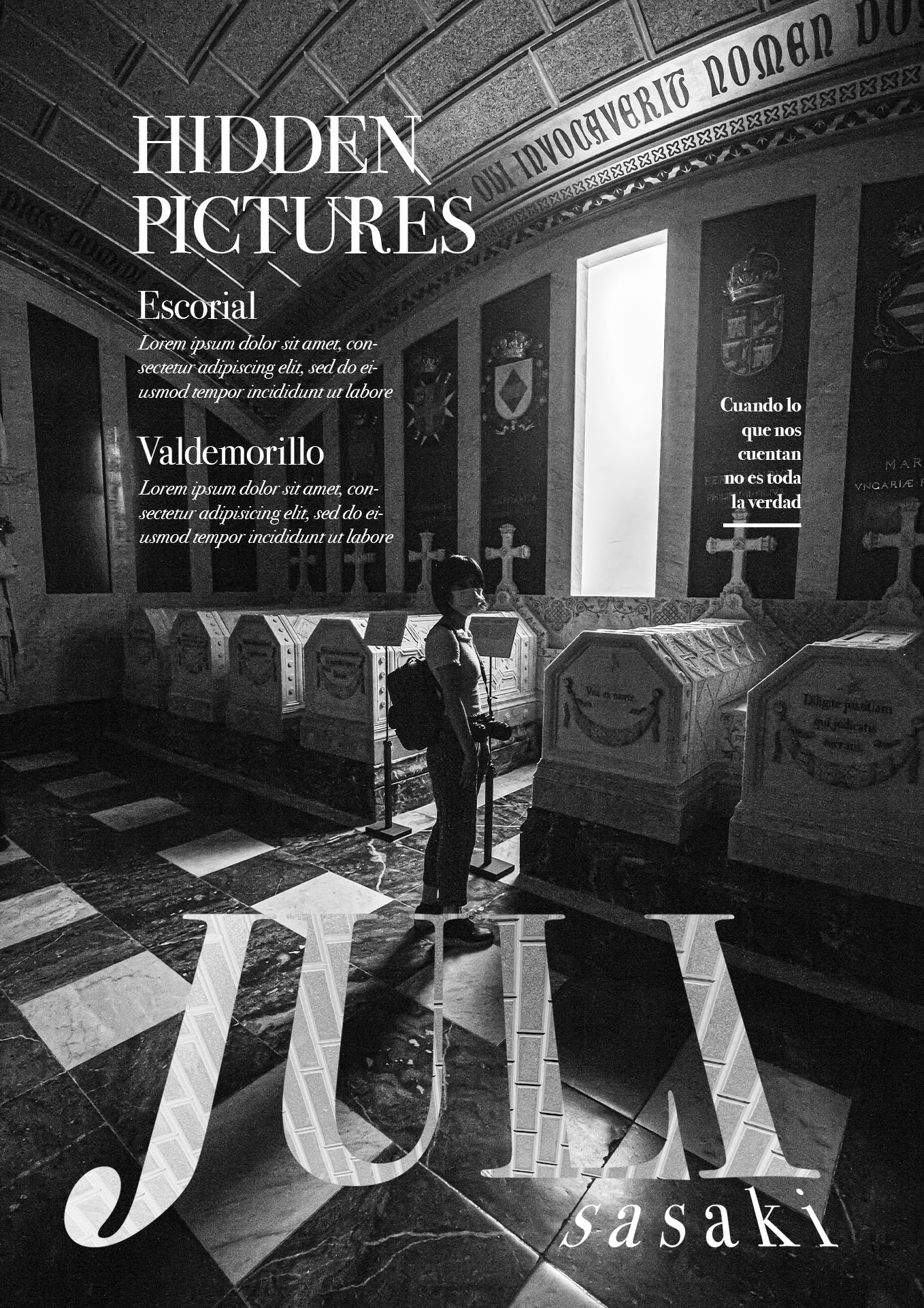
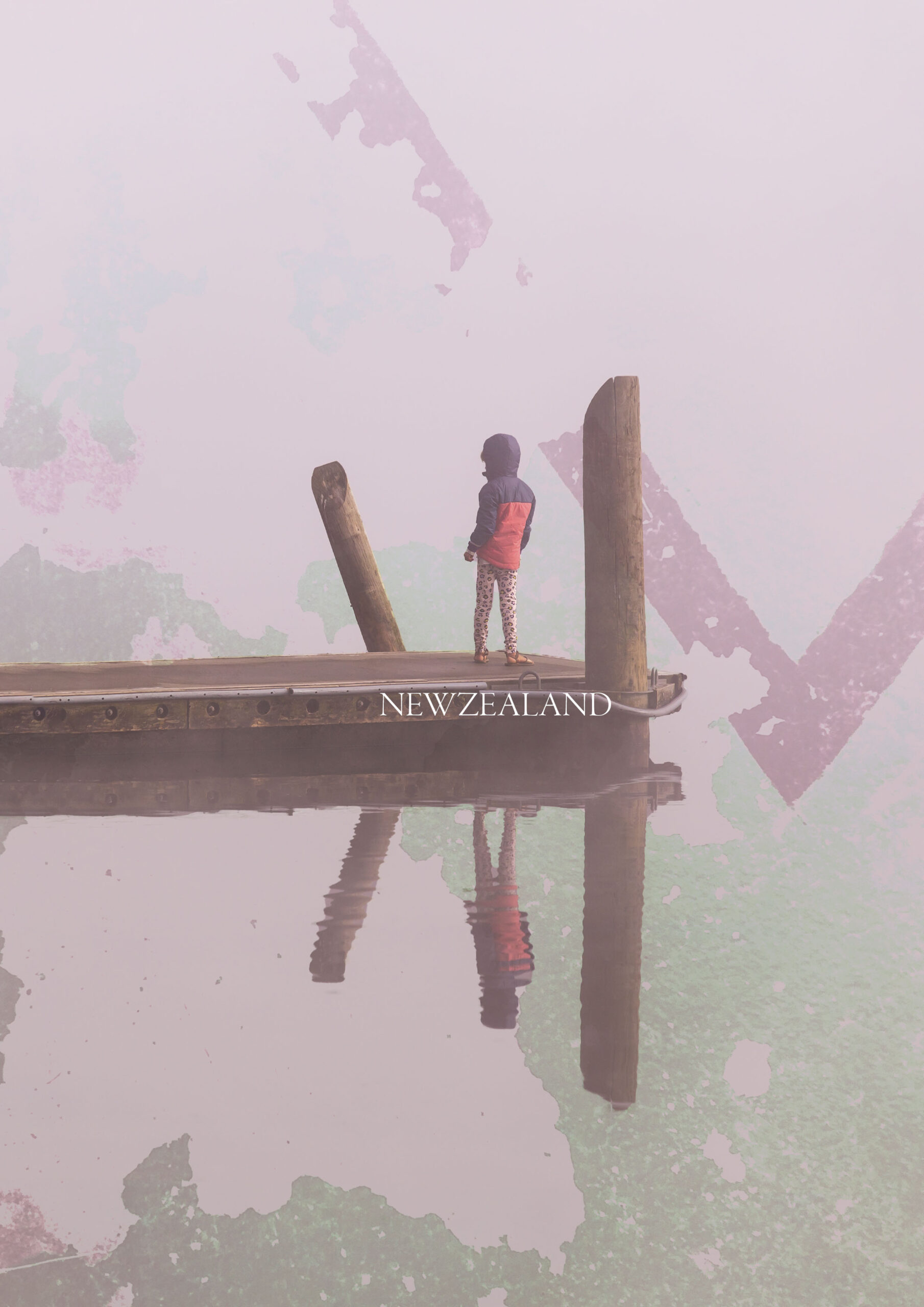
MAGAZINE POSTER TEST #2
20-50 minutes per version
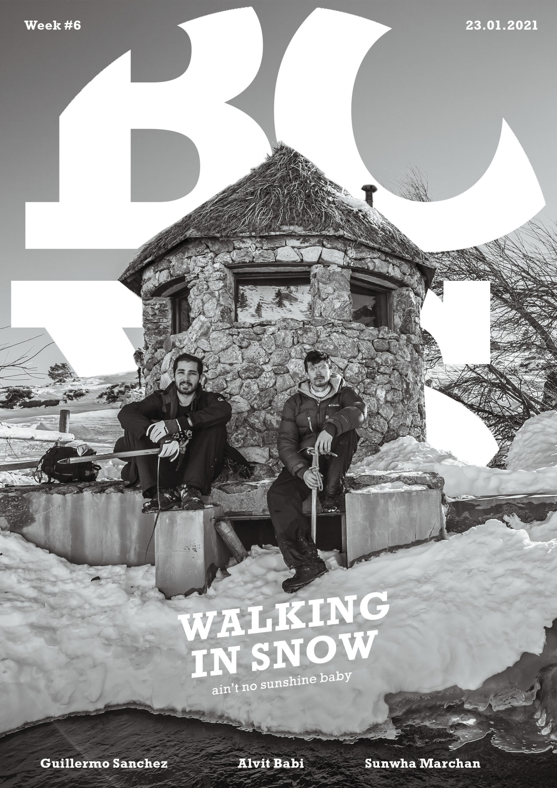
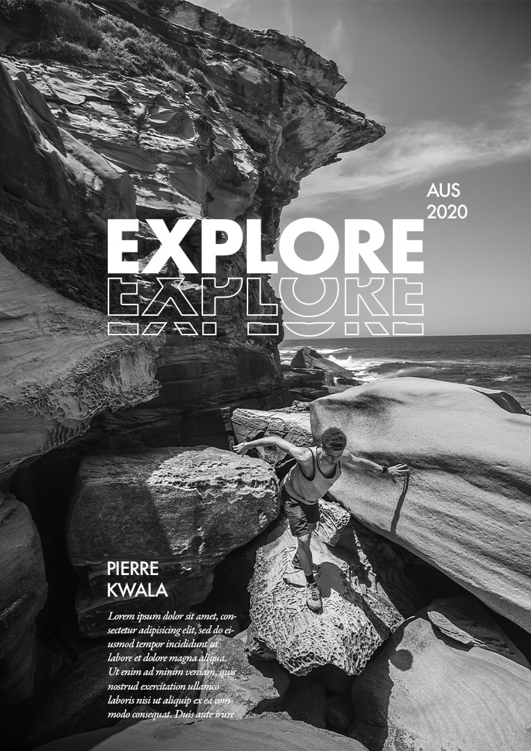
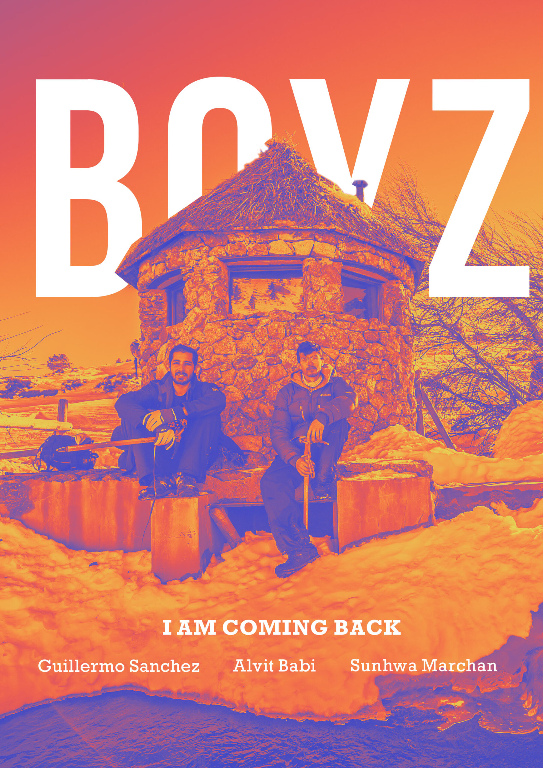
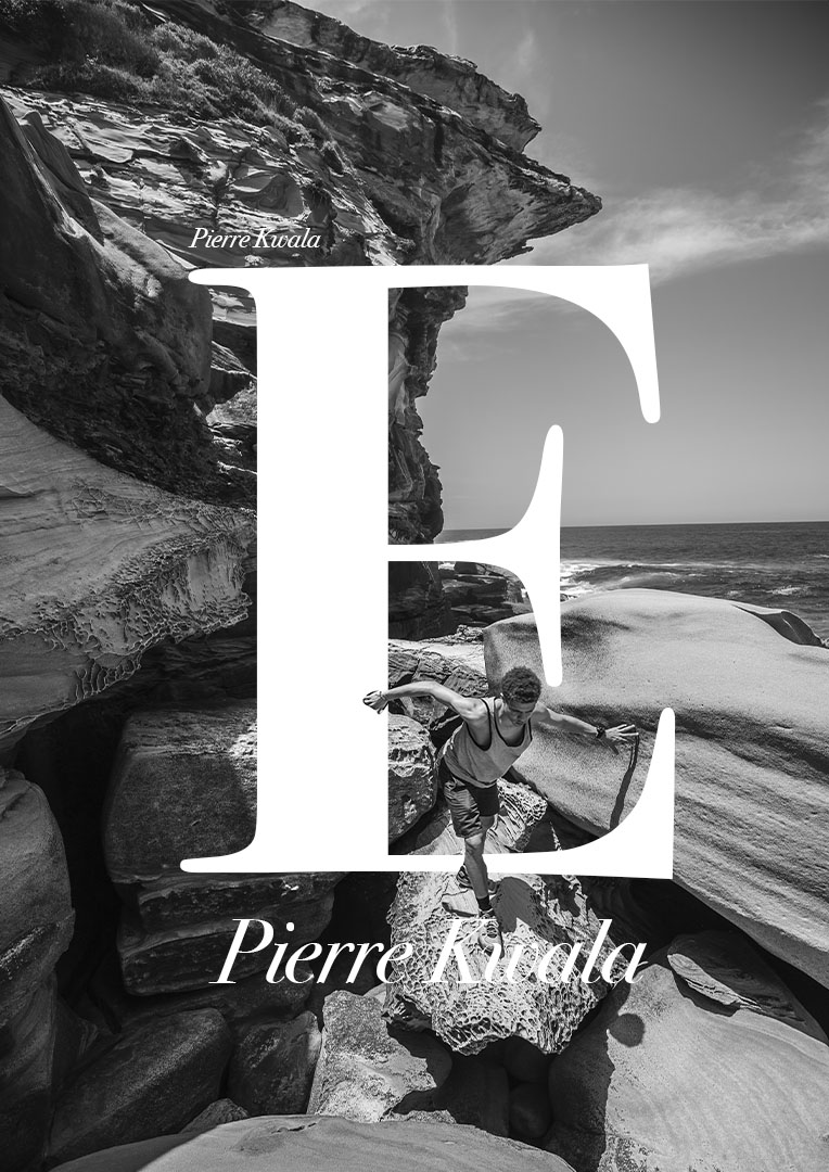
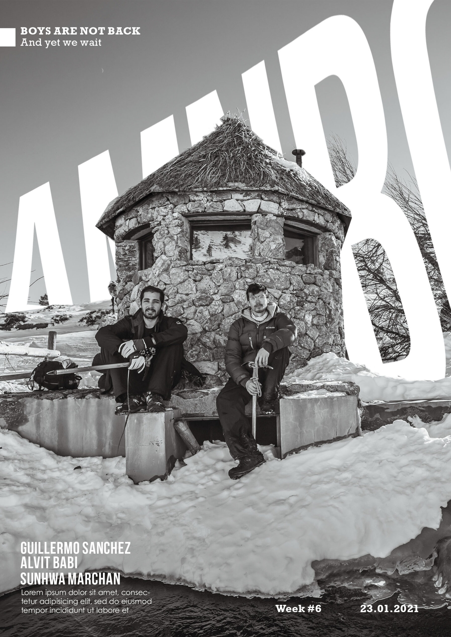
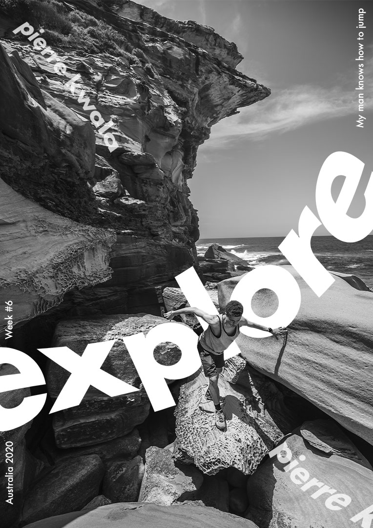
Last week I couldn’t practise because I had a lot of work to advance. This week I kep practising magazine style covers.
I learnt a few interesting things. First is to select a picture with potential (it’s easier if there is a clear subject/people in it); second is to understand the dynamic of the picture by drawing the main lines of them; third is to work with B&W first to see how to create dynamism in a simple way.
I’m still figuring out how to properly add the main text to the picture, in the sense of having a big size word to complemente the subject of the picture.
Note to myself: it’s very helpful (essential) if I have proper text and information that I want to include before starting the designing…

