WEEK #8-9
26th of September to 7th of October
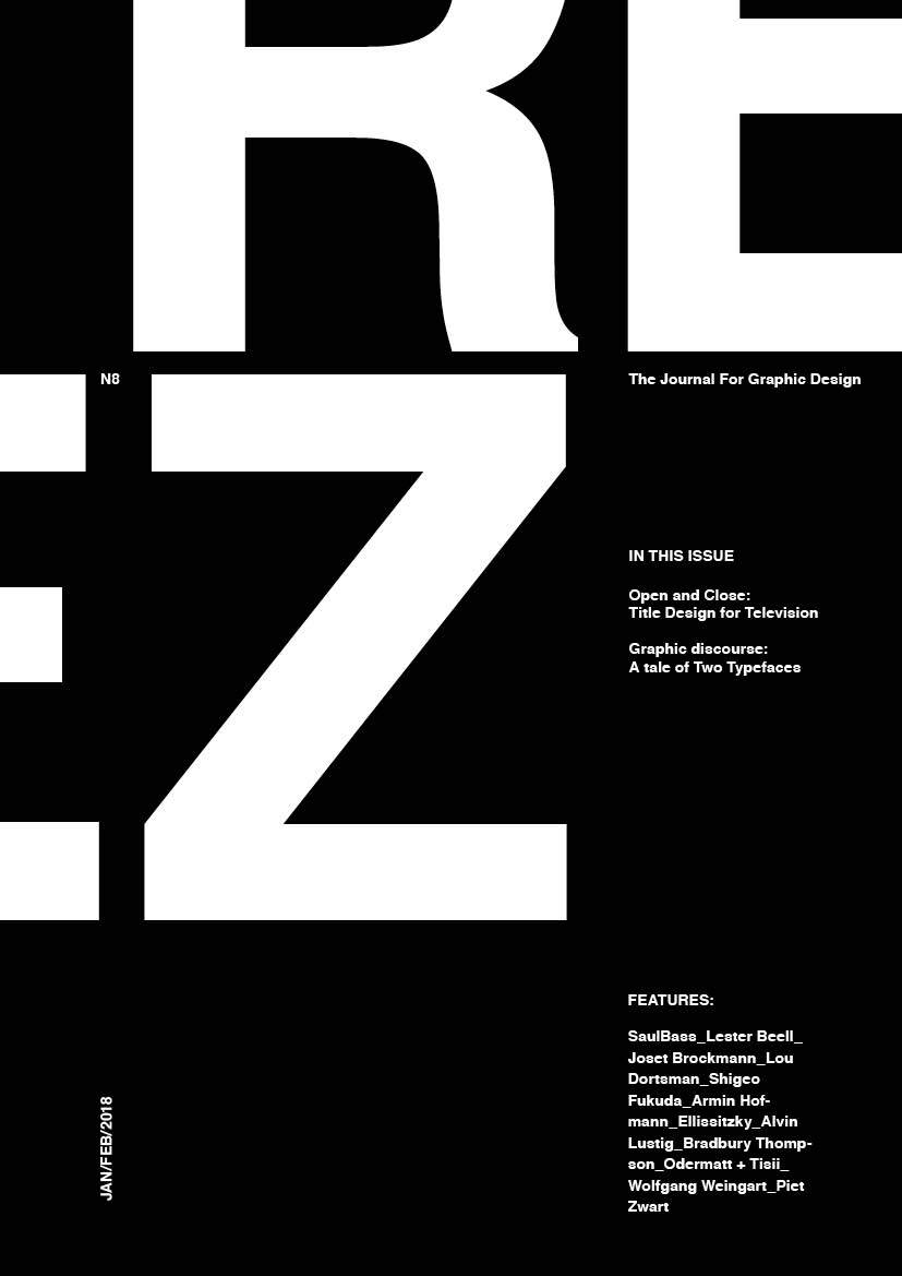
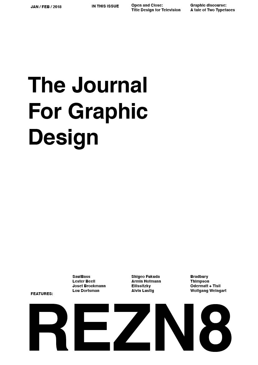
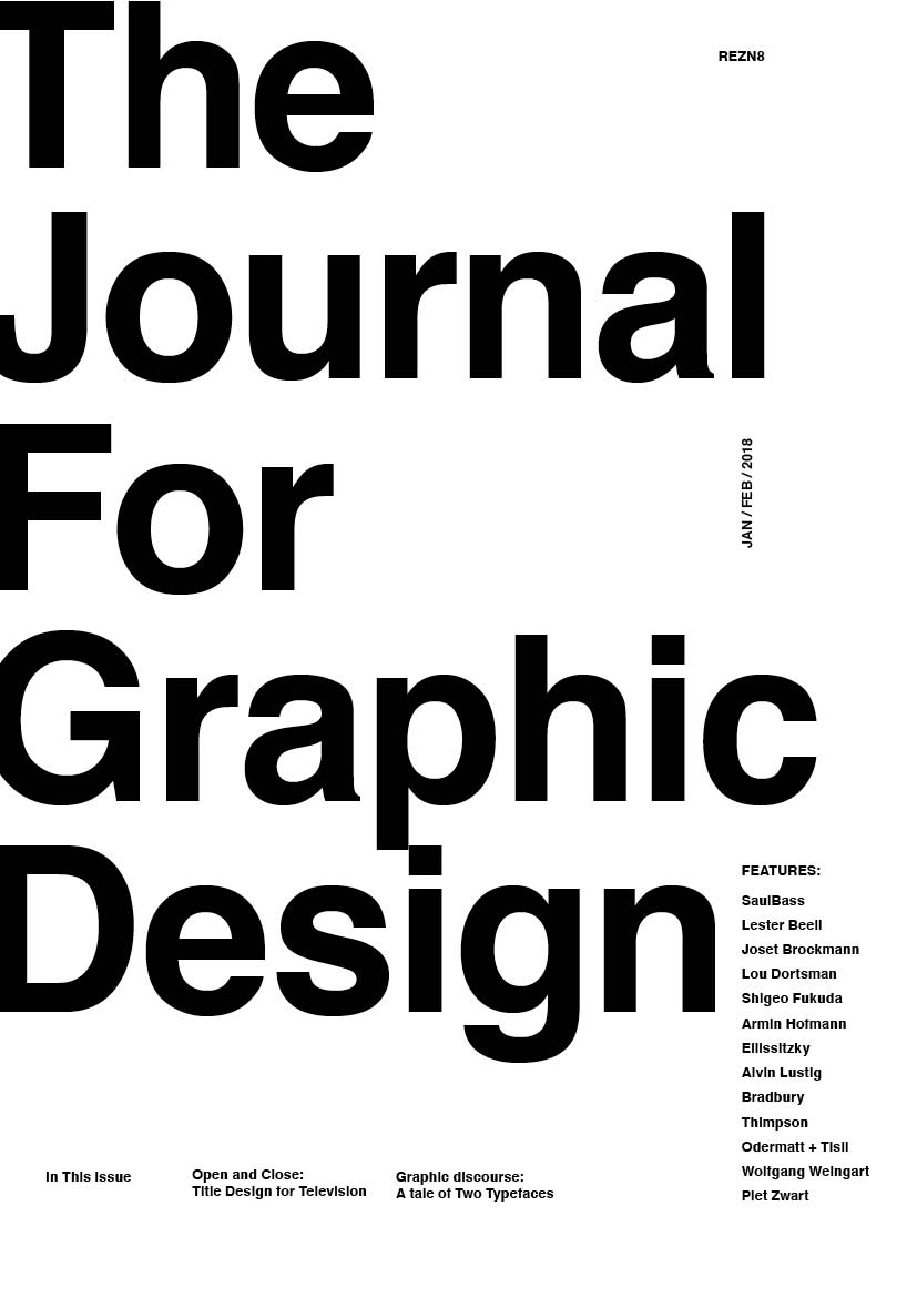
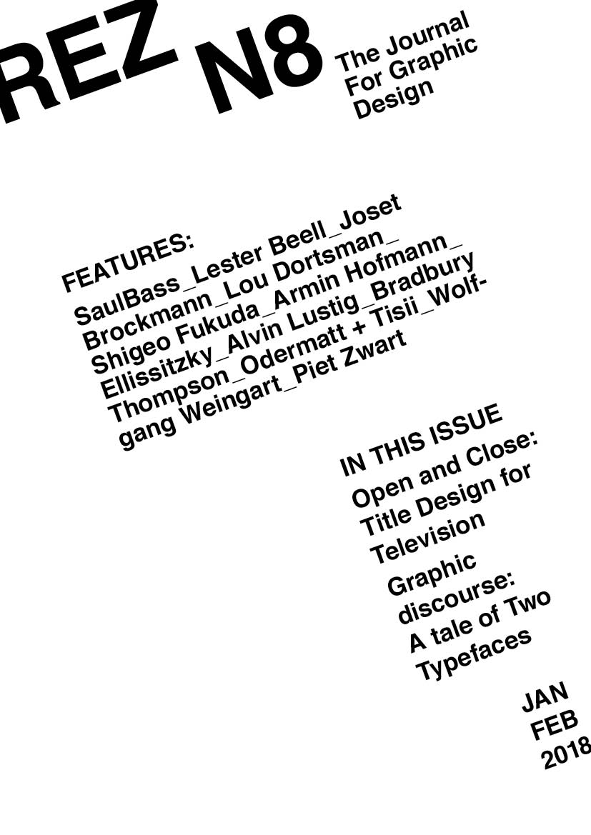
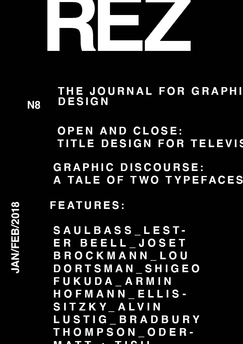
THE FUTUR POSTER PRACTISE #3
60 minutes / 5 posters
Exercise: 1 family font, 2 point sizes
Continuing the practises that the youtube channel the Futur uploads. It focuses on poster design, specifically with the theme of fonts.
I’m learning quite a lot by understanding how to make dynamic compositions within the limitations of the exercise. Also I fell in love with Helvetica. I think as a font works better in small caps. But that’s just my feeling now.
DAKUJEM
40 minutes / 3 posters
Dakujem means «thanks» in Slovak. It became a running theme between our friends in a trip that we had in Australia. Previously all of us spent time in Slovakia and out of the few words we knew, this one become a meme for us.
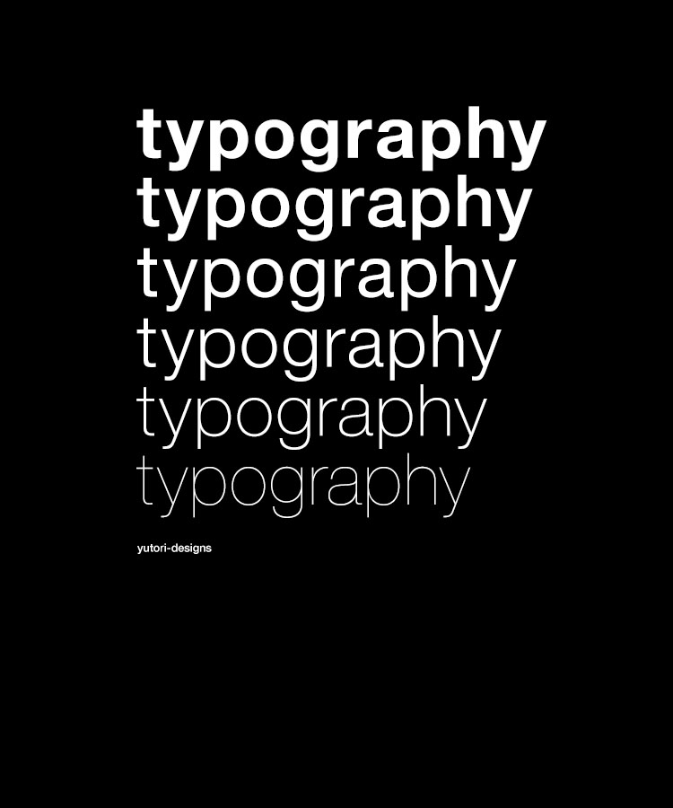
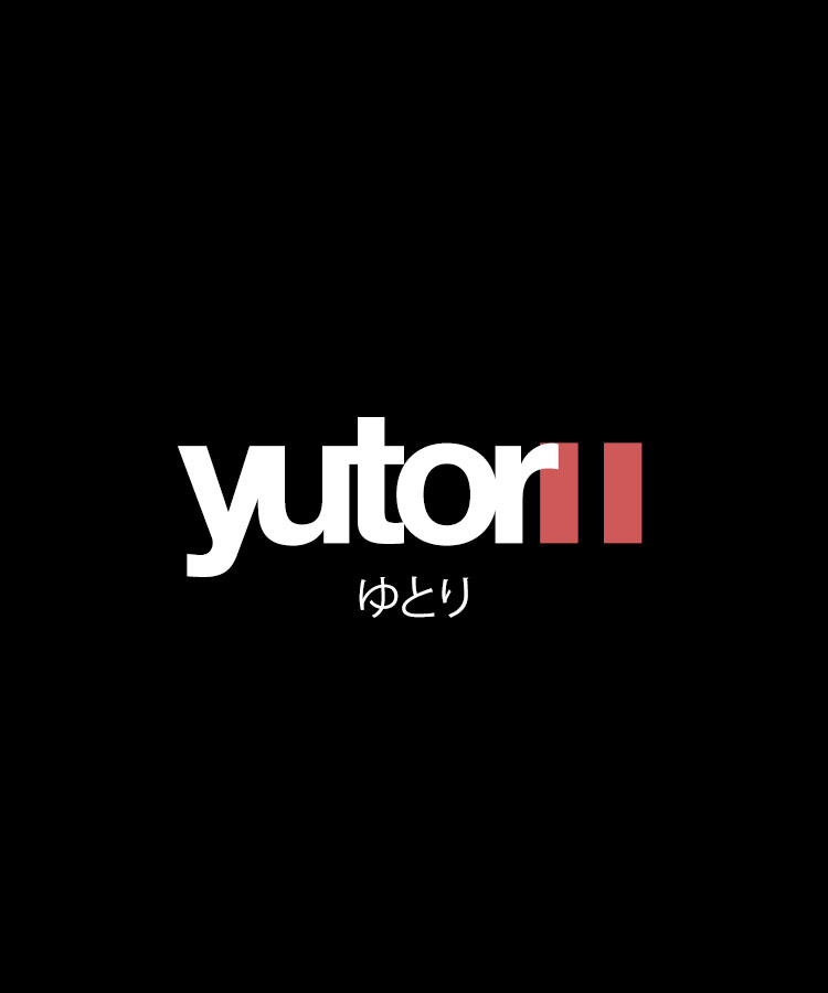
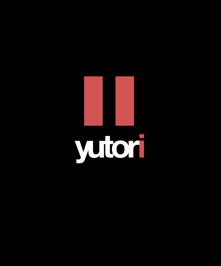
T-SHIRT DESIGNS: TYPOGRAPHY AND YUTORI
120 minutes / 3 designs
I would like to get better at t-shirt design and also at logo making.
The word «yutori», which means like «space» in japanese, is part of my life philosophy. It represents the need and benefit of having physical and mental space in between things and actions. I’m trying to find a conceptual representation of this, and that’s why the exploration of the symbol «pause». I want to do a course on illustrator for logo designs…

